Chapter 17 - Multi-platform publishing and developing your skills as an editor
Multi-platform publishing and developing your skills as an editor
How to create smartphone apps, tablet computer editions and print versions of your content
In the book version of this chapter we will cover:
- Why multi-platform publishing is essential
- The creation of smartphone app editions
- The difference between web and native apps
- The principles of designing apps for smartphones
- Examples of successful apps
- Getting the right content on your app
- Simple software that lets you build smartphone apps
- Creating tablet computer magazines and print editions:
- The principles of designing and editing a magazine for tablet and print
- Getting the right content ideas
- How to commission text, stills, video, audio and more
- Templating
- Flat planning
- Why we need to build tablet versions of our websites
- The principles of designing tablet computer versions of your website
- Simple software that lets you build a print and tablet publication.
At the end of the chapter are a range of assignments and projects to enable you to practise what you have learned.
Here we will look at:
- Step-by-step tuition in the use of a range of publishing applications, including those featured in the book version
- Tuition in a range of alternative publishing platforms
- Addition resources and supporting material.
Always have the book version of Multimedia Journalism to hand while you use this website – the off- and on-line versions are designed to work together.
17C1 Introduction to multi-platform publishing
Tips for multi-platform publishers: www.journalism.co.uk/news/-desktop-isn-t-dead-advice-for-multiplatform-publishers/s2/a562754/
Digital advice from the FT: www.journalism.co.uk/news/change-or-risk-extinction-advice-for-multiplatform-publishers-from-the-ft/s2/a562622/
Three magazine approaches to multi-platform publishing: www.journalism.co.uk/news/-ppaconf-how-three-magazine-titles-approach-multiplatform-publishing/s2/a552906/
17C2 Why we need to build tablet versions of our sites, and create smartphone apps
These links relate to the discussion of news consumption on tablets and smartphones discussed in the book version of this module.
Pew Internet Project Research revealed that 43 per cent of Americans aged 16 or over have either a tablet computer or eBook reader. The same survey found that 57 per cent of men and 54 per cent of women have a smartphone: www.pewinternet.org/2013/10/18/tablet-and-e-reader-ownership-update/
UK, mobile Internet traffic overtook desktop access in 2014: www.intelligentpositioning.com/blog/2014/01/mobile-and-tablet-traffic-set-to-overtake-desktop-by-mid-2014/
News consumption on mobile devices: www.journalism.org/2012/10/01/future-mobile-news/
17C3 Examples of good smartphone apps from news organisations
Top 10 news apps for iOS: www.macworld.co.uk/feature/iosapps/top-10-news-apps-ios-read-newspapers-your-ipad-iphone-3493967/
Buzzfeed
Buzzfeed is currently among the most successful journalism outfits. Its ambitions are encapsulated in this quote from its founder, Jonah Peretti (http://cdixon.org/2012/07/24/buzzfeeds-strategy/): "When you compare web publishing today with what Hearst and Conde Nast built in the last century, it is clear that online publishing has a long, long way to go." Peretti says that, as sites such as Facebook and Twitter mature, the time has come to build a defining company for a modern media world in which content is distributed through sharing and social media rather than print and broadcast channels. He ask: "Why shouldn’t we be one of the companies that builds this future?"
Want to write and create content like Buzzfeed? These links show you how to do it:
The following post, ‘10 Ways To Get Traffic Like Buzzfeed’, analyses how Buzzfeed creates effective content, and gives you a template to follow:
www.searchenginejournal.com/10-ways-get-traffic-like-buzzfeed-without-paying/95943/
The Buzzfeed guide to writing blog headlines:
How to write quiz titles like Buzzfeed:
www.business2community.com/content-marketing/write-quiz-titles-like-buzzfeed-01007285
Feedly
17C4 How to build a smartphone app
Creating an app with AppMakr
What follows is a fairly comprehensive summary, but if you need more info, you'll find links to a comprehensive guide to using AppMakr at the Support area of the AppMakr site – you have to be logged in to access it.
I chose to mention AppMakr in the book version over all the other platforms that are covered below because I think it gives journalists the best and easiest platform to create a really engaging app.
Its social engagement functions include having a live chat area, and a Fanmappr, which lets users see where they are in real time and send instant messages to each other.
It offers stats on your usage, and guidance on promoting the app. It's also affordable: there are three price tags, starting with free.
Once you have named your app you add content. You click and drag from a range of icons into a phone screen area. For each icon you add – website, blog, social media platform – you add the RSS feed link, choose or upload an icon and set a background colour for it.
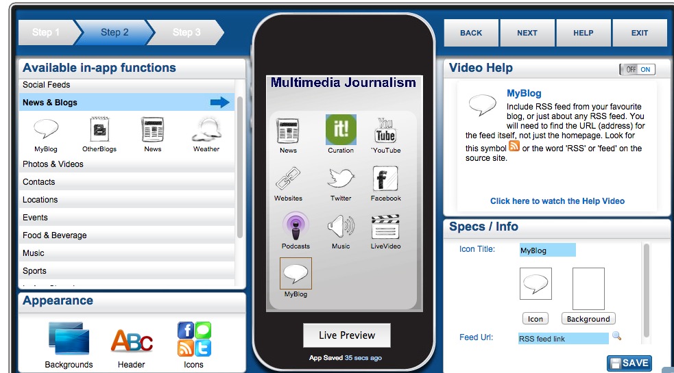
You really want to fill the screen with 12–15 icons. The choices you get in each category don't always give you the one you'd like. So, for instance, under Live Video you get UStream but not Bambuser. Under photos you get Flickr but don't get Instagram. Under music you can't link to a Spotify playlist but you can link to an album on iTunes or Amazon.
However, as long as you have an RSS feed for the content you want, you can add it. Just use an RSS icon, then rename it and upload an appropriate icon design of your own.
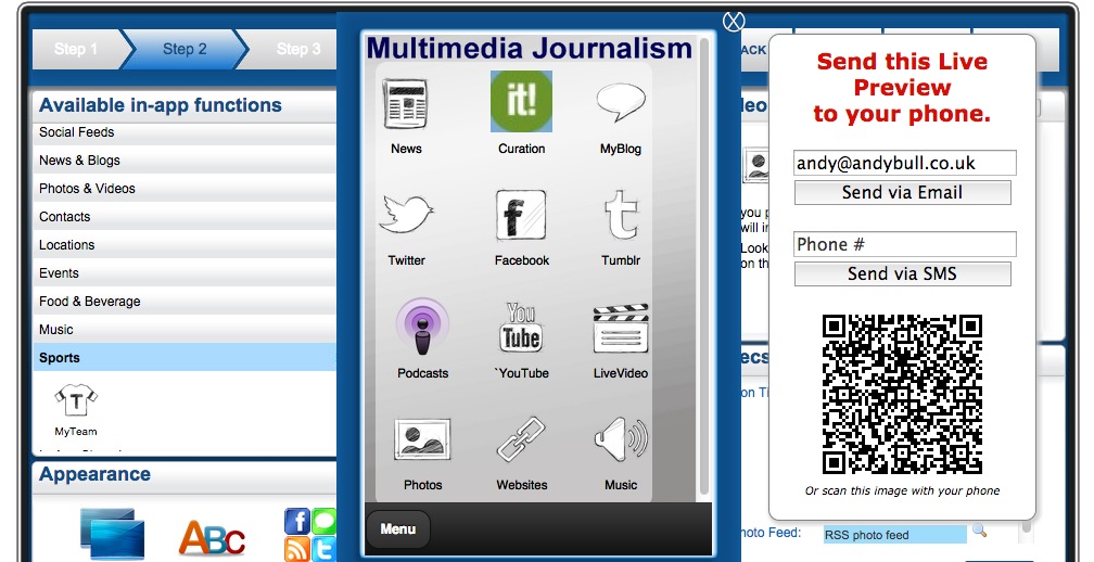
At any point you can send a preview of your app to your phone, so you can check things are working correctly.
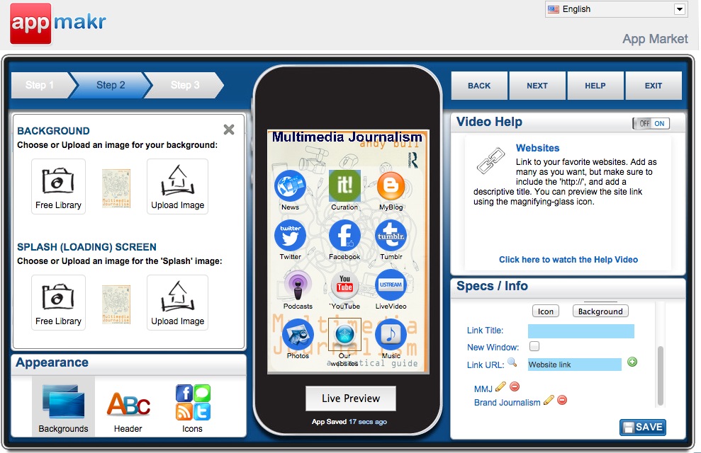
You can also design the app, choosing background colours and a splash screen. You want the app to share the branding on your website, so it’s best to use the colour and any relevant logos or images you have created there.
Then comes the publication process that involves:
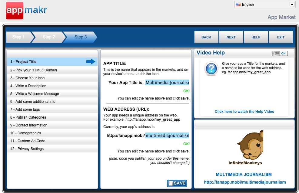
- checking you have the correct title for the app,
- that you are happy with the URL you are given (there are numerous options relating to different industries and subject areas),
- choosing your mobile phone homescreen icon – you want something clear and simple here
- writing a description and welcome message
- adding tags, publishing categories and contact information.
Finally you get to publish.
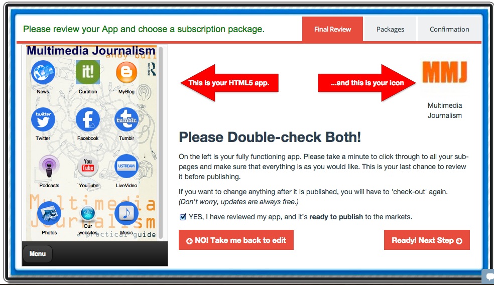
Don't want the world to see your app yet? During this final set-up you can make the app private for now. Once you are done you get the URL for your app and some advice on publicising it.
Building apps on alternative platforms including MobileRoadie, GoodBarber, Mippin and 3D Social Hub
When a new app-building platform is launched, they often start out with a generous free option, but then begin charging. Mippin Mobilizer, for example, used to have a free option, but now charges £99 per year to publish your web app and £999 annually for each of the native apps it publishes on your behalf.
It publishes apps for many media organisations, and it's easy for you to create a professional-looking app on the platform. So if you can stretch to £8.25 a month, it's worth considering. But we'll look at some alternative app-building platforms that still have a free option. They include MobileRoadie and GoodBarber.
Building a smartphone app with AppMakr
Next:
You'll be taken step-by-step in creating an AppMakr smartphone app.
Mippin Mobilizer
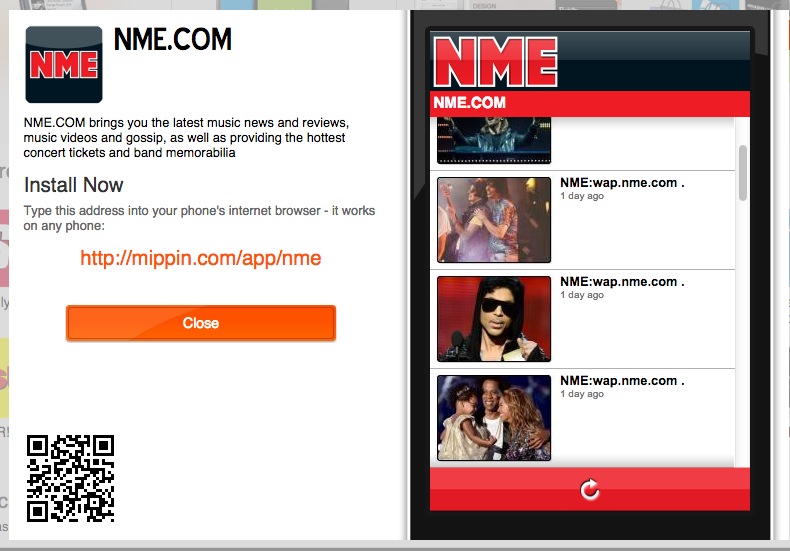
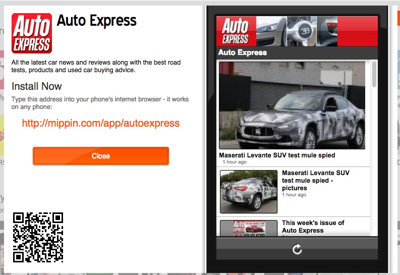
Take a look at a couple of commercial apps built on the Mippin platform
Showcase www.mippin.com/web/?p=showcase
NME
AutoExpress
Building a smartphone app with Mippin
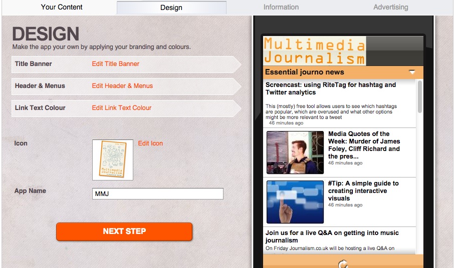
The first building screen has the content input area on the left, and a representation of what that content will look like on your phone on the right.
You add your feeds one-by-one, using either the address of your website, RSS feed or Atom feed. If you give your website URL Mippin will look for an RSS feed there.
I'm going to build one using an RSS feed I created for a MailChimp Bulletin, a mashup of several sources of news about multimedia journalism that I consider equates to daily essential reading; my curation on Scoop.it; my YouTube channel and my beat blog. I can't add Twitter on this version, which is a big minus, but I can on native apps.
Here's the first channel added:
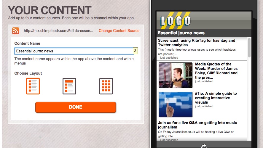
Gather your feed URLs before you start
That way you can quickly paste them in to whatever platform you are experimenting with. You could build on three or four and decide which looks best for the kind of app you want to create.
Here they are all added successfully.
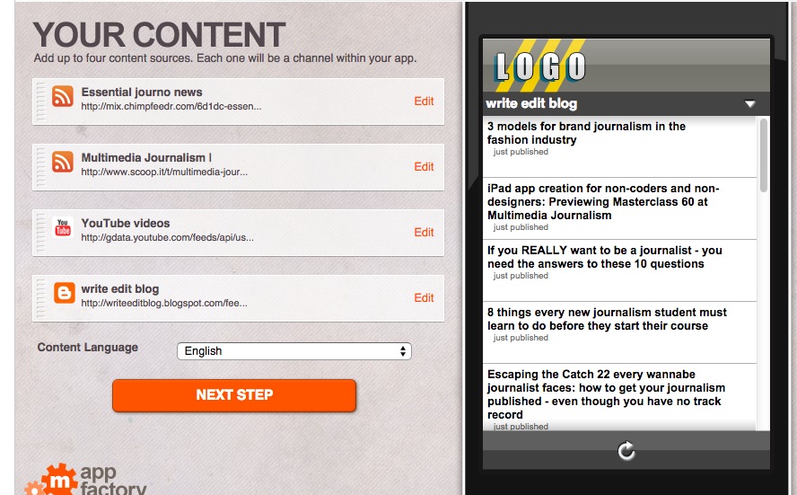
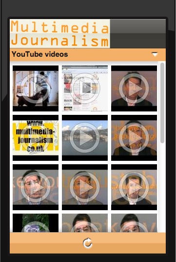
I can choose between three page templates, one with the stories run simply in line, another with the first pulled out for better display, and a third where images appear in a grid. You must be sure that each of the elements in this channel has illustrations before you select this one.
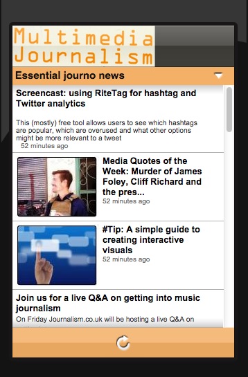
Here's my essential journo news channel, from my RSS mashup:
Here's my YouTube channel using the image grid template.
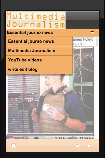
These form separate channels on the app, and I switch between them using a drop-down.
Then I design the site, adding a header, adjusting the colour scheme, and creating an icon to appear on.
Building a smartphone app with Good Barber
With Good Barber your free period is a month.
Despite its silly name, Good Barber immediately feels like a platform for journalism. The first screen you are shown on the app you are making includes articles, photos, video, Twitter, Facebook and sound.
Design
There is a theme library of designs, many of them directed at niche interests such as a wedding or holiday. You can preview themes before selecting them, and switch themes later if you find you've picked the wrong one.
Design your app by customising the navigation mode, header, body, splashscreen and icon.
As you build you can see previews within the application for iPhone 5, Nexus 5 and iPad Air.
Content
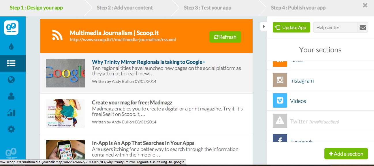
You add a source for each of the content areas, and can add new content areas too if you wish. Click on any content area and then on Settings and you can add the source required.
So, under articles I can choose from by WordPress site, my Blogger blog, an RSS feed or several other options. Click on any one of those and you get the instructions of how to connect the source with your app.
I can add my RSS news feed here, and then click to add a section to bring in a second RSS feed where I can paste in by curation stream.
Instagram goes into my Photos section, YouTube into my Videos section.
For some reason, adding Twitter is not straightforward. You need to go into the Twitter developer app – but they give step by step instructions on this.
Testing your app
If you download the My GoodBarber app you can get a preview of your app directly in your phone or tablet, as both html5 and native app versions. Login and you’ll be prompted to test your app. If you like the result, you can move on to the next step: submitting your app to the stores.
Building a smartphone app with Mobile Roadie
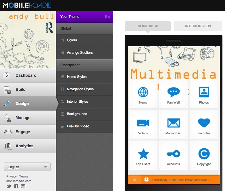
Most other platforms will help you create native apps, but Mobile Roadie only lets you build native apps, and submits them for approval on your behalf. Its apps also work on iPad. They'll submit it to the app stores for you, but you must have iOS developer credentials. You sign up for those through Apple's developer site, at $99 per year.
Their intro video:
You get a 14-day free trial and then pricing starts at around $100.
There is a customer app visualiser called MobileRoadie Connect that you download from iTunes or Google Play in order to preview your app as you build it. Do that at the start. Each time you make a change you can refresh your app on your phone and immediately see if it has worked.
Back at the website CMS you can design and build. With MobileRoadie you choose what order you do things in. As with other platforms, you pick to customise an overall theme, select templates for individual screens, set your icon and splash screens and add content.
Build
Under 'build' you can add content. A number of pre-set content areas are in place, and while you can add to them from a list of extras, you can't remove buttons that are in place. The problem is that several of the content areas provided are not ideally suited to a journalism site. MobileRoadie is optimised for the creation of fan or brand sites, but it's maybe no bad thing that we aim to build a fan base around our content. And it does make adding multimedia content, and creating a chat area, very easy.
There is flexibility on how you add content to the sections you are given – you can add individual items, link to accounts or sometimes hashtags, or paste in RSS feeds.
Let's run through the main buttons that would be of use for doing journalism on the platform.
Home Gallery
MobileRoadie apps have strong visual impact because of this feature. You can add images and turn your photos into a slideshow or swipeable gallery. You can also link images to featured content.
News
Under news you can add RSS feeds, Twitter feeds and Google News keywords. While adding content to this or any other area you can choose the layout.
Fan Wall
This is an area for your users to chat with each other, and makes interaction with your community easy.
Photos
You can add photos from sites including Instagram, Picasa and Flickr, connecting to an account or a hashtag.
Videos
You can add video from services including YouTube and Vimeo, selecting either individual videos or adding channels.
Sections you can add
Twitter can be added as a separate stream, and you can either add an account or a hashtag.
There are all sorts of live sections you can add, but only when you upgrade. To add my curation area, I have to do so by naming a links icon Curation and adding an html link to the area on Scoop.it where I curate multimedia journalism. Not ideal, but workable.
Design
Design is more complicated here because you have to adjust some elements for the various versions of iPhone, as well as for Android.
It's worth downloading their design guide, a pdf that takes you through many of the principles of designing for mobile, and is relevant even if you decide to build on a different platform.
Design is divided between what MobileRoadie calls the home view – the main content indexing page – and interior view, which is what the user sees when they click through to any one of your content areas. There is also a 'universal' area, where you set site-wide colours.
The 'arrange sections' button lets you install the buttons to your various content streams as you want them. You get two pages, on which sections will be visible to users, and a hidden section, for sections you don't want to use. Clearly it's best to have all your navigation on the first page.
Under home styles you can customise your app’s header and background image, under interior styles you can sort out the rest.
17C5 Creating a magazine with both tablet computer and print editions
You'll find an overview of how a magazine comes together.
Here we'll go step-by-step in creating a magazine for both tablet and print.
Choosing a publishing platform for your magazine
Madmagz
You may not need a publishing platform for your magazine, but, if you do, I’m going to work with a freely available editor that allows you to create an online magazine that can be flipped through and looks good on tablet computers, and for which you can also create a pdf version, and pay to have it printed if you like.
It's called Madmagz (www.madmagz.com) and it's useful in that it lets us work through the whole production process, and will give us a magazine that works both online and as a print product.
How to create your Madmagz magazine
There's a really comprehensive FAQs guide here: http://madmagz.com/faq
How to build a magazine on Madmagz
Choose your overall design template
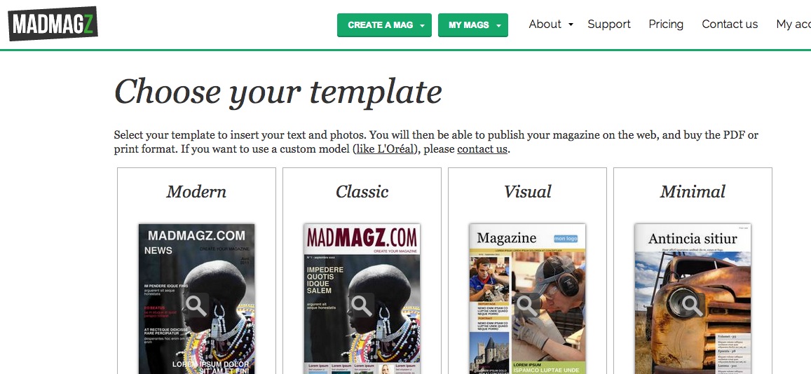
With Madmagz, there are a range of magazine designs you can choose from. Once you pick one, you can add pages. Pages such as contents, an editor's letter, a briefs page, a feature, a full page image and so on are available to click and load.
Most magazines – whatever the platform they are created on – are built up from pre-designed templates. Not only does it make layout quicker and easier, it also ensures that the design set for the magazine – usually at great cost and with a great deal of work – cannot be over-ridden by a keen sub with eccentric ideas on how they think the magazine should look.
Madmagz uses templates and gives you a range to choose from, designed for particular types of article and slots in the magazine. So, for each element you add, you can choose from a number of individual page templates.
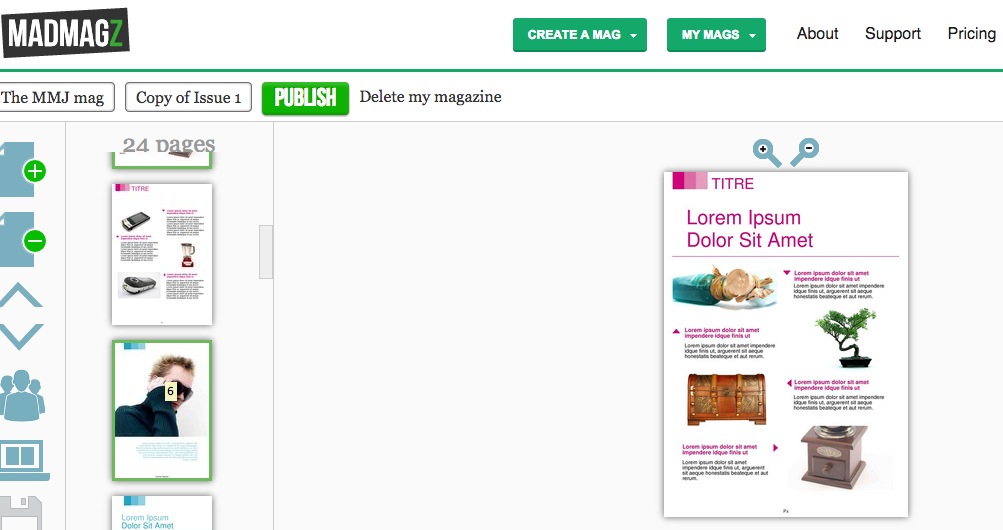
Above, for example, is a template designed for the sort of 'nuggets' section that often appears within the first few pages of a magazine.
Once all the templates have been selected and assigned, the magazine is ready to have content added – the sub-editing stage.
Sub-editing
With each page in the layout I click the element I want to modify – headline, text or image, remove the holding material and upload, write or paste in what I want to replace it with.
I can change typefaces, colour of text, and size of text boxes as I go, which means the template sets parameters that I can adjust to suit the particular article.
When you add images, the software tells you whether they are of sufficient quality for all formats, or pdf or web only. It rejects images that are just too low definition.
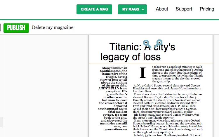
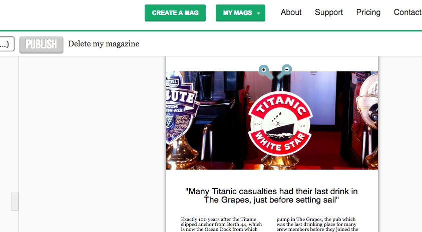
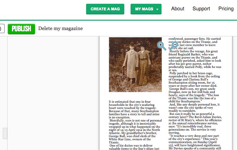
As an example, here are three details from the subbing of one article from my magazine, written to mark the anniversary of the sinking of the Titanic.
Proof-reading
Unfortunately you can't print out your pages for proofing on the free plan, but you can if you upgrade. What you must do if at all possible is to pass your proofs to another member of the team for this final check.
The relevant department head, and the editor will also want to take a look.
Previewing
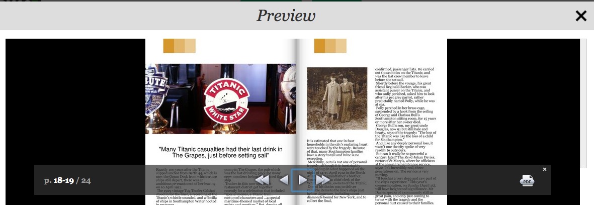
At any stage you can generate a preview copy of your magazine, which you can flip through. This is an opportunity for the editor, or anyone else, to make sure the balance of the whole publication is right, as well as checking on each individual item.
Publishing
Once you are happy, you click to publish, and get a link to the online version of the magazine, plus invitations to buy pdf and print versions. You can also share it for free on social media.
17C6 The editorial process – from idea to published article
![]() Find a concise guide to the editorial process.
Find a concise guide to the editorial process.
Here, we'll discuss some elements of that process in more detail.
When commissioning a feature...
- Have a clear idea in your head of what you want
- Have the headline written in many cases, so everyone has an immediate idea of how the piece will be sold and what it will look like
- Know exactly why you have come to this particular writer
- Know what you want the piece to say, in detail
- Know the structure you want
- Know the opinions you want, the conclusion you want
- Know how light-hearted or serious you want the piece to be
- Insist on going through your ideas in detail. (If commissioning on the phone and you sense the writer is not taking notes, suggest they do.)
- You know you are doing well when the writer is chipping in, bringing up anecdotes which illustrate the points you area asking him to make.
But then he or she puts the phone down. On occasion, the writer then goes off and forgets all you have said, and turns out a completely different and useless piece. Those are the writers you don't use again.
Commissioning art, pictures, cartoons
If you need to brief a photographer, do so along with the writer, so both get the same message – avoid Chinese whispers.
Many who commission photos are confused by the jargon used by photographers and feel unable or unqualified to assess their work.
In fact you can trust your instinct on which picture works best, and leave technical considerations – choosing one picture over another because it is sharper etc – to the photographer.
Use the photographer’s work well, and credit it as you would a writer’s piece.
Poor use of photographs makes photographers reluctant to work well for you.
One picture used well is better than several used badly. Resist the temptation to try to tell the whole story in pictures, or to be very literal in what you feel the picture should contain and illustrate.
With a cartoonist
They are wonderful at finding an amusing angle on a story and you need to leave that part of the job to them – don’t suggest jokes.
With an illustrator, the approach is similar to that of a headline writer. You can help the illustrator by giving an idea of the headline.
Copyright
UK copyright law was toughened with the implementation of the Copyright and Related Rights Regulations 2003.
The move brought UK copyright law into line with the EU Copyright Directive which primarily aimed to protect software, film and music producers. However, it also affects producers of literary works, such as journalists, by removing some of the previous exceptions to copyright infringement such as using material for research, either for personal or commercial purposes.
Moral rights
Moral rights are the rights of an author to be identified (by-line or credit) and not to have the work treated in a "derogatory" way i.e. altered so that it becomes prejudicial to his or her honour or reputation, for example through the distortion of what was originally submitted or the introduction of mistakes. The 1988 Act excludes moral rights in some areas of work.
But here's a distinction that is very important for us: it does not apply in the reporting of current events, or publication in newspapers, magazines or other periodicals.
If a freelance has signed nothing, they retain their rights
However, if you send them a contract and they ignore it, their silence may legally be regarded as agreement. They need to write back to you rejecting your terms if they are to be sure of retaining their rights.
The National Union of Journalists (NUJ) recommends freelances ask for three times the original commission fee if they are to surrender all rights.
It is important to remember that the laws on copyright apply also to the Internet.
Categories of rights you might purchase
- Single use
- First British serial rights
- UK syndication rights
- Second/subsequent British serial rights
- European syndication rights
- First EU serial rights
- US syndication rights
- Second/subsequent EU serial rights
- Internet publication rights
- First US serial rights
- Electronic publication (eg CD-ROM) right s
- First World serial rights
- Electronic archive rights (as part of original publication).
Copyright – exceptions
There are two big exceptions to the copyright rules.
- Reporting on current events. That means if JK Rowling died the TV news could include a reading from Harry Potter.
- Reviews. Somebody writing a review of a new book can include some examples of the writing.
How long protection lasts
- Written work – until 70 years after the author's death
- Broadcast material – 50 years
- Films – until 70 years after the director's death.
What a freelance is entitled to confirm with you when you commission them
- What is the name and position of the person commissioning them?
- What have they agreed to do or supply?
- In what form must the work be delivered (hard copy, disk, email)?
- What rights are being licensed?
- When is the deadline?
- How many hours or days are they being commissioned for?
- How much will they be paid?
- What expenses will be paid?
- When will they be paid?
- Should they invoice? When? To whom?
- Have you dealt with all relevant insurance issues?
- If they are supplying materials such as transparencies, when will they be returned?
17C7 Creating a newspaper or magazine for tablet only
Examples of newspaper tablet editions
The FT
The Times
The Guardian
www.theguardian.com/mobile/2014/may/29/the-guardian-and-observer-daily-edition
Video: www.theguardian.com/mobile/2014/may/29/the-guardian-and-observer-daily-edition
So what were they aiming for, and how did they achieve it?
The Guardian's creative director, Mark Porter, said (in a post on his site markporter.com which is no longer available online) of the app he worked on: "it succeeds in what it sets out to do – deliver the content of the printed paper on the iPad in a form that feels completely at home on the device."
Porter analyses the whole process of creating the app in the blog post linked to above. Here's a summary of what he says.
There was a debate at The Guardian, he says, as to whether the app should be more dynamic and live. They decided not, because the website and other mobile apps were focused on delivering breaking news.
They decided to make an app that appealed to newspaper junkies who wanted a more print-like experience, but to avoid imposing a print design on it.
They took into account evidence (www.journalism.org/2012/10/01/future-mobile-news/) that people use their tablets when they are at home and relaxing, and can consume news and entertainment in depth and for some time.
Mark Porter's explanation of how The Guardian's iPad app came into being gives us many valuable pointers as to how to approach creating a tablet edition.
The tablet edition of our print product needs to be a logical extension of it. You need, he says, to keep some of the way a newspaper presents the news to you in a hierarchy of importance, as sifted by the editors.
Porter explains that, when we look at the pages of a print newspaper, we take in a range of stories at once. Those stories are of different levels of importance and this is reflected in how much space they are given, size of headline and positioning on the page. Readers can skim through the paper before deciding where to stop and read, getting a quick overview of the day's news.
Editors have decided on those priorities, based on their experience and news values, and when a reader chooses a certain newspaper they are buying into those decisions.
A successful adaptation of a newspaper to the iPad needs to retain that reading experience.
So The Guardian created a series of secondary front pages for the different sections of the paper, where the content within them was summarised and could be scanned.
Here's the technical explanation of how it's done, and how the iPad edition differs from iPhone and Android apps.
Those latter apps are populated sing feeds from the website, just as we built smartphone apps using feeds earlier in this chapter. The iPad app, in contrast, recycles the already-formatted print newspaper pages.
The pages InDesign are converted by a computer script and automatically rebuilt for the iPad edition, retaining the decisions on position, and prominence that the stories were given by the human editors working on that paper editions.
Then human editors refine and improve what the computer has produced.
The app design process
Andy Brockie from the Guardian's digital design team shared the key stages behind the design development of the iPad app (www.theguardian.com/media/gallery/2011/oct/13/guardian-ipad-edition-design-evolution)
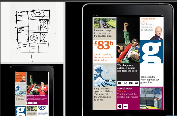
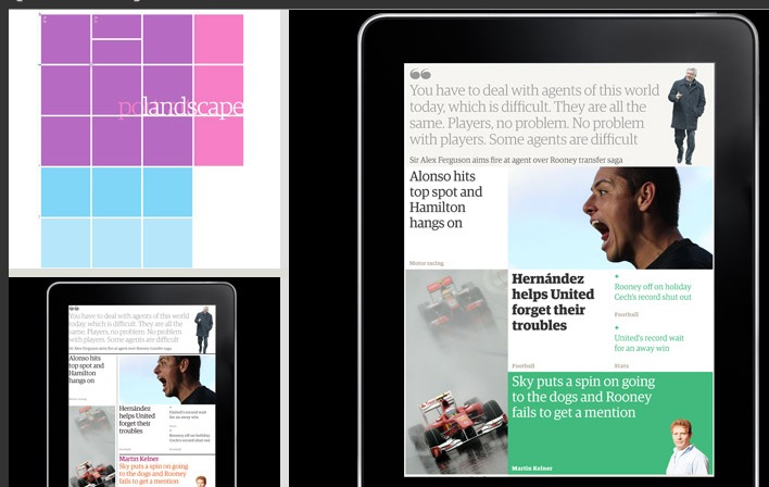
Brockie says they began with the look and feel of the newspaper, and then adapted it. They wanted a design and navigation that was simple and clear, but still true to the character of the paper. The solution turned out to be the grid approach that Mark Porter spoke of above: "We created a grid that would work in either orientation and put colour and character on the bones."
Here's that grid:
And here's how the grid then underlay everything they built on the app:
Next they decided on typefaces to use and honed the design. At the same time they were experimenting with mock-ups of how the app could be navigated.
Following these stages, they set the colour backgrounds that would underlay articles in different sections of the app, and developed templates that individual articles could follow.
One of the final stages was how to build a live stream into the app. They chose a back page concept, which, Brockie says is: "a launchpad to our website that's built from the Guardian's API. When you have a connection you'll get the latest news, video, comment and interesting topics. In contrast to the other sections, and because of the way it's built using feeds, it has the same layout every day."
So that's an insight into how tablet apps are created, and the sort of choices and decision that have to be made along the way. Now let's look at ready-made platforms that enable you to create your own tablet computer app edition.
17C8 Building your own tablet computer edition
Building a tablet app on 3D Social Hub
One of the best available tools is called 3D Social Hub. You build on it as you would one of the smartphone app platforms we looked at earlier, and it is one of the simplest and best-looking of the aggregation apps.
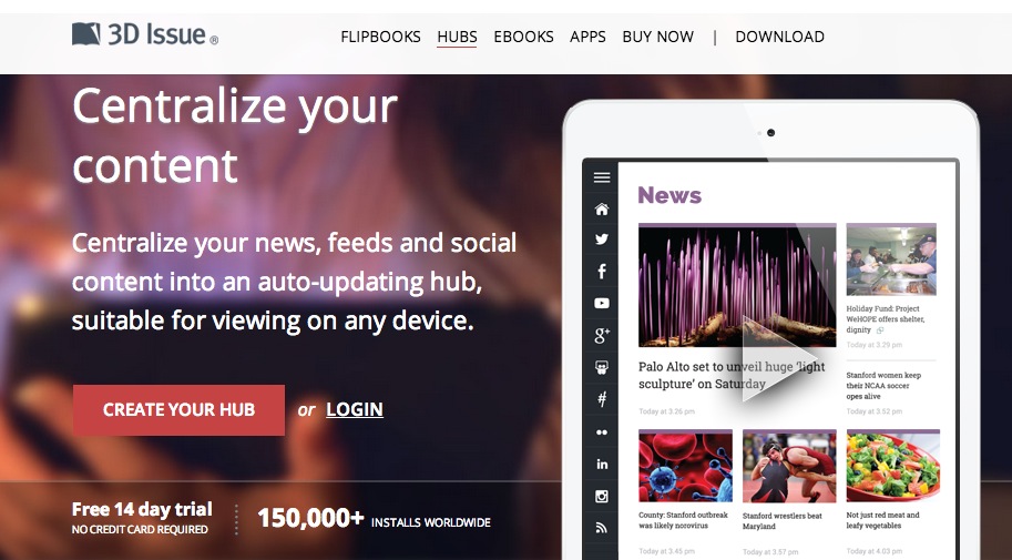
There are three things that make 3D Social Hub preferable for tablet app building:
- You can also add a URL to pull in an article from a website,
- You can write content direct into the app
- It renders each of your feeds in a far more aesthetically-pleasing way.
It doesn't just link out, which often means that when you click on a headline you are taken to the article in its original setting, with a consequent clash of look and feel. Instead, it pulls the piece in to the platform, so you move seamlessly to the full article, with no clash of designs.
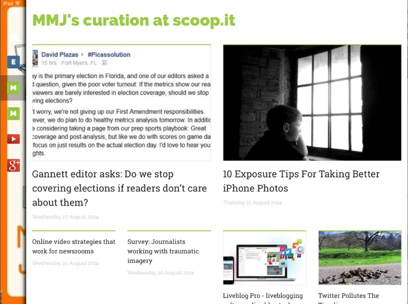
Above, for example, is my Scoop.it curation feed. Where many smartphone app builders offer it up as a simple list, 3D Social Hub gives it a pleasing layout. It does the same with each of your feeds, from Twitter to your news feed.
In this it replicates what AppMakr (see top of chapter) does with the personal feeds I add in to it.
This video explains how it creates a responsive magazine from your content http://youtu.be/CNcnUumwfgM
How to use the platform
This video runs you though set up http://youtu.be/rN6s0JZMGYc
Using the platform is very similar to how we built on AppMakr and other software. Essentially, you first pull in your sources. You can add RSS via the feed URLs or just add a URL and have it find the feed on that site. As you add sources you can add a title for each – if you don’t the feed URL will appear in your navigation. You can click and drag from a list of icons to add all your social platforms.
But it's the ability to add a URL from an article, and to write, or paste in, an article directly to the app that makes 3D Social Hubs better suited to the sort of tablet publication we aspire to creating.
Once your feeds and content are in, you add your logo and background image.
You come to a managed content screen where you can rearrange the order of the feeds, and also go in and delete any items from feeds that you don't want to appear.
You get a URL, and can view your site on a tablet, smartphone or the web. You can also embed it or share. Usage is free for two weeks.
Notes
- www.pewinternet.org/2013/10/18/tablet-and-e-reader-ownership-update/
- www.intelligentpositioning.com/blog/2014/01/mobile-and-tablet-traffic-set-to-overtake-desktop-by-mid-2014/)
- www.journalism.org/2012/10/01/future-mobile-news/
- www.theguardian.com/media-network/media-network-blog/2014/feb/11/18-reasons-readers-love-buzzfeed-publishers
- http://thenextweb.com/apps/2013/04/03/the-ft-launches-an-all-new-ipad-web-app-featuring-personlized-myft-hub-a-morning-edition-and-more/