Chapter 13 - Data journalism
Chapter 13 Data journalism web version
In the book version of this chapter we will cover:
- What data journalism is
- How to find data
- How to filter data
- How to create data visualisations
- Examples of data journalism.
At the end of the chapter is a range of exercises and projects to enable you to practise what you have learned.
Here we will look at:
- Links to all the material discussed in the book version
- Practical step-by-step tuition in creating a range of data journalism projects
- Essential updates on tuition that take into account advances in data journalism techniques.
Always have the book version of Multimedia Journalism to hand while you use this website – the off- and on-line versions are designed to work together.
13B1 What data journalism is
This TED talk explains why visualisations of data work so well
Get a full historic perspective on how data mining has been the source of powerful stories for centuries. Paul Bradshaw: Is there a canon of data journalism? http://onlinejournalismblog.com/2014/05/20/is-there-a-canon-of-data-journalism/
13B2 Examples of data journalism, and what can be achieved
Examples from The Guardian
Afghanistan War Logs
Special report page, providing information from many angles, based on leaked documents published by Wikileaks:
www.guardian.co.uk/world/the-war-logs
Here's the interactive visualisation The Guardian produced form the data:
www.theguardian.com/world/datablog/interactive/2010/jul/26/ied-afghanistan-war-logs
Investigate your MP's expenses
An innovative crowdsourcing application allowing users to check 458,832 documents, adding indications whether the documents should be investigated further or not.
The project explained:
www.theguardian.com/gnm-press-office/crowdsourcing-mps-expenses
How to take part:
www.theguardian.com/news/datablog/2009/jun/18/mps-expenses-houseofcommons
The data presented in different ways:
DATA: all the latest MPs' claims listed – sortable list view
DATA: all the latest MPs' claims listed – standard Google spreadsheet
https://docs.google.com/spreadsheet/ccc?key=0AonYZs4MzlZbcnZXZ0VFR0s5eHVVUUJSMUVGY3hIV0E#gid=0
DATA: MPs' total expenses (if you have a Google account)
DATA: Lords expenses as a spreadsheet
www.theguardian.com/news/datablog/2009/may/15/lordreform-mps-expenses
The app: http://mps-expenses.guardian.co.uk/
MP Expenses: Who claimed what? The full list includes an open spreadsheet for every MP:
Examples of data journalism from the Financial Times
These were presented by Cynthia O’Murchu at Data-driven Journalism.
Oil and gas chief executives: are they worth it? www.ft.com/cms/s/0/190f9e7c-bd8d-11de-9f6a-00144feab49a.html
Currencies in context www.ft.com/cms/s/0/9a2fdf12-b725-11de-96f2-00144feab49a.html?ftcamp=rss
Interactive Graphic: The carry trade explained www.ft.com/cms/s/0/f3aec6c2-b99e-11de-a747-00144feab49a.html?ftcamp=rss
The pension crisis www.ft.com/cms/s/0/e82a672e-4ab4-11de-87c2-00144feabdc0.html?nclick_check=1
ProPublica
Where do your members of congress stand on SOPA (a Bill concerning online piracy) and PIPA? (a Bill concerning the theft of intellectual property) http://projects.propublica.org/sopa/
Associated Press
US Election results 2012
http://hosted.ap.org/interactives/2012/election-trends/
Wales Online
Welsh children in care
www.walesonline.co.uk/news/wales-news/concerns-raised-over-welsh-children-2026375
13 B3 The three steps of data journalism: gather, process, visualise
The NYT Rent or Buy, discussed in the book version: www.nytimes.com/interactive/business/buy-rent-calculator.html
A guide to data sources
Tip: Think about your beat or specialism when searching for data sources. If you can find data that relates directly to the journalism you do, it will be immediately relevant to your work.
Wikipedia's comprehensive listing of national and international statistical organisations:
http://en.wikipedia.org/wiki/List_of_national_and_international_statistical_services
UK government: Data.gov.uk http://data.gov.uk/dataset/coins.
Top 10 data.gov.uk data sets from Simon Rogers (then of The Guardian, now of Twitter):
http://data.gov.uk/blog/my-top-ten-datagovuk-datasets-guest-post-simon-rogers
USA government: Data.gov www.data.gov/
13B4 First data journalism project
http://www.andybull.co.uk/masterclasses/masterclass-1-data-journalism-new-practical-projects/
13B5 How The Guardian does it
![]() We go step by step through the processes The Guardian undertook to turn the raw data from the Afghan war leaks into useable, cleaned-up data and then into visualisations. The links referred to in the books are below.
We go step by step through the processes The Guardian undertook to turn the raw data from the Afghan war leaks into useable, cleaned-up data and then into visualisations. The links referred to in the books are below.
What is data journalism at The Guardian:
Read the full story of the leak:
www.theguardian.com/news/datablog/2010/jul/27/wikileaks-afghanistan-data-datajournalism
Simon Rogers on how the Afghan war leak material was processed
You can download the full overview spreadsheet of cleaned-up data here:
https://spreadsheets.google.com/ccc?key=0AonYZs4MzlZbdGVxRTRleEZHTmhxa3VCN1p6aGJuR0E&hl=en#gid=0
Visualising the data
Newspaper visualisation:
www.scribd.com/doc/34850058/Afghanistan-IED-attacks-2006-to-2009
Online visualisations:
Interactive guide to all the IEDs: www.theguardian.com/world/datablog/interactive/2010/jul/26/ied-afghanistan-war-logs
Interactive 'front page' to their selection of 300 key events:
www.theguardian.com/world/datablog/interactive/2010/jul/25/afghanistan-war-logs-events
13B6 10 More data journalism projects
These projects will be updated or replaced if they cease to function as indicated within the tuition.
A project using Tableau
Tableau enables you to create several visualisations from a data set and present them together.
That means it is a very rich source of information for readers, and it lets you present that information in an instantly appealing way:
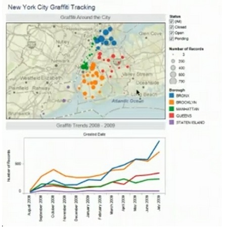
You can build a visualisation with a map, and separate visualisations, such as graphs going into detail on one aspect of the data, alongside it.
Here's what Tableau says about itself: "Tableau Public is a free application that brings data to life. Create and share interactive charts and graphs, stunning maps, live dashboards and fun applications in minutes then publish anywhere on the web. Anyone can do it, it’s that easy—and it’s free."
Tableau's team say you don't need to be a programmer to use the software. It takes no knowledge of Flash or other programs to create interactive graphs, dashboards, maps and tables from virtually any data, and to then embed them on your website or blog.
That said, I haven't found Tableau always behaves as it should.
While the free version at: www.tableausoftware.com/public/download should be fine, I found that the Desktop version: www.tableausoftware.com/products/desktop for which you only get two weeks free trail, behaved better during the project outlined here, in which I've replicated an exercise on the site.
There is a sequence of Tableau's own video tuition here www.tableausoftware.com/public/training
If you get stuck, you should be able to find the guidance you need at that link.
Tableau suggests the following exercise to demonstrate what you can do with it. Here's what it involves related to the three-step approach to data journalism we are using:
Find data: from a US city authority source
Process or filter data: in this example, data is already clean
Visualise data: in Tableau
Find data
Go to https://nycopendata.socrata.com/
Use the search term 'Graffiti'
One of the results returned will be titled DSNY graffiti information:
https://data.cityofnewyork.us/City-Government/DSNY-Graffiti-Information/gpwd-npar
Download this data file as an Excel spreadsheet (we did that in module 13B4 in the book version).
Once you have the data saved, copy it and then go to Tableau.
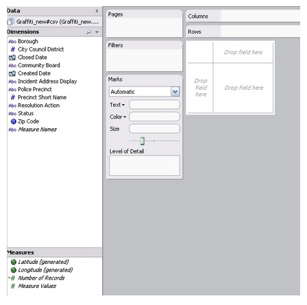
Click on open data.
This interface opens:
Visualise data
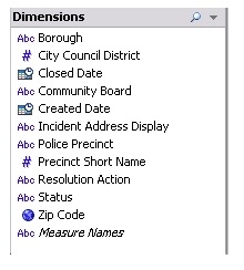
In the left-hand column you’ll get this information.
Dimensions.
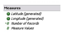
Measures.
You should have zip code under dimensions.
Click to select zip code. Under records, click to select number of records. You may have to hold down Control to get both to select together. Click on Show me in the top command bar, and Tableau shows which types of visualisation can be created from the parts of your data you have selected.
One is maps. As a map is a key way to present this data, click to select map.
Here it is:
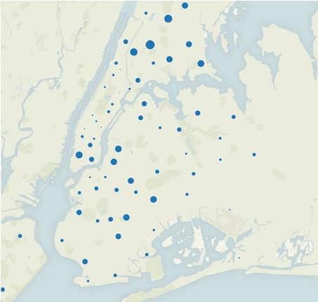
Now that’s ok, but the data we have logs graffiti incidents in each of the five NY boroughs.
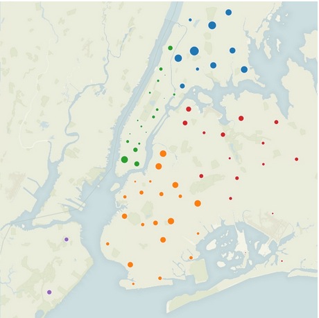
We need to do something to the map to make it show these areas, and to make results from each borough stand out, one from the other.
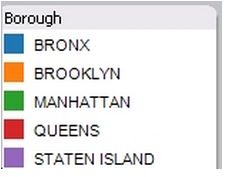
If you drag the word 'Borough' from under Dimensions and drop it in the Color spot, the incidents from the different boroughs will be coloured separately:
And the map's key will show this:
Turn on the streets and highways option from the index on the right of your screen to show more detail.
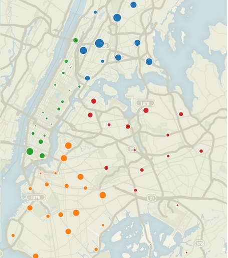
That’s great so far. We can see from the size of the blobs where most incidents occurred, but we can do much more with Tableau. We can create separate visualisations to demonstrate information that we can't easily show on a map, such as when the incidents occurred.
To see when the incidents occurred you can create a trend line, which shows data over time.
To do that:
Create a new worksheet by right clicking on Sheet 1, the worksheet tab at the bottom of your screen, and selecting new worksheet.
Now we can create a new chart. Drag Created date from the Dimensions block to the column shelf at the top of your screen:
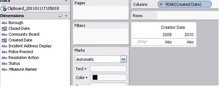
Add the number of records to the Row shelf which is just beneath column:
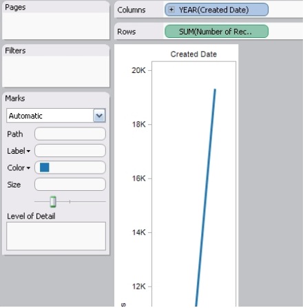
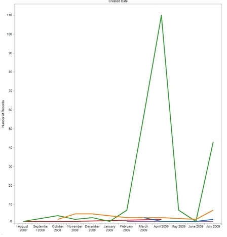
The line generated indicates the change in the number of incidents reported between years. This is what it looked like when I completed this exercise, but the result will be different for you because the data you are working on is constantly updated.
So while I saw a big jump in the number of incidents from one year to the next, you may see something different. Remember you are looking for stories in the data, so big rises or falls in the amount of graffiti reported are significant.
Let’s change the level of detail to take a closer look, by month and year
Click the pull down on Created date and select month and year (which you’ll find appears when you hover over the word More).
You get a lot more detail:
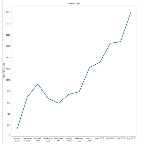
The graph shows a steady rise. When you do it the data may have changed and show different results, and hence give you different stories.
Add Borough to the Color spot again and you get the incidence of grafitti in each of New Yorks’ five boroughs:
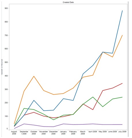
That's how much graffiti has been reported. Now let’s see how much of this grafitti has been cleaned up.
We do that by adding a filter. Right click on the Status field (you’ll find status in the left-hand column) and select Show quick filter.
In the dialogue box that pops up top right you can see the options for displayed information, all are ticked and so on the graph:
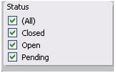
Turn them all off except pending, and you see how many reports have not been acted upon. In my results I got a large number of incidents still pending from April:
Now we have two graphs created from the data, we can combine them on what Tableau calls a dashboard.
Right click alongside Sheet 2 and select New Dashboard. Drag the sheets you have created onto the dashboard (you’ll find them listed top left). I get both my visualisations either side by side or, if I drag and release the second one towards the bottom of the screen, one above the other:
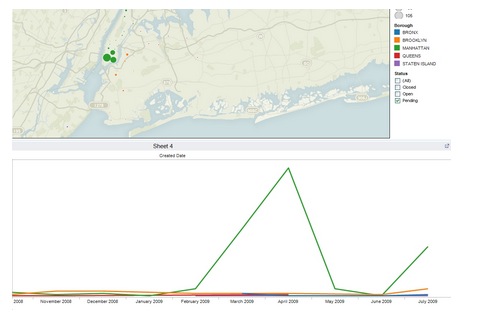
Tableau has automatically added the legends (map keys) and the filter to the dashboard.
Now you can further customise things:
- Arrange view
- Add or amend titles on the visualisations by clicking on the titles and adding new text
- You can change fonts and colours to match your website
- Add a title to the whole dashboard by clicking on Objects, title, right click to edit title.
You can add further tables by creating them on a new worksheet and then importing them into the dashboard.
Publishing
Select the best display size for your visualisation.
Under Size, at the bottom of the left hand column, click on edit, and choose. I’ve kept with the 420 small blog setting.
Click file, save to web.
You get a preview. Click the share button to get the embed code you need.
13B7 Adding geo-located information to a map
Find data: Guardian data
Process or filter data: Google Spreadsheet
Visualise data: Mapalist
This is a data visualisation exercise from The Guardian, which involves creating a map from a spreadsheet that lists all the Second World War prisoner of war camps that there were in the UK.
Find data
First, some preliminaries.
You need your Google account and to have Google Fusion Tables activated:https://support.google.com/fusiontables/answer/2571232?hl=en
You also need to sign up for an account with Mapalist: https://mapalist.com
You can export to Google Fusion Tables from many sources. This time we'll export from The Guardian's Data Bank.
You need to get data into your Google account before you can work with Mapalist: www.google.com/fusiontables/data?dsrcid=implicit
I chose this one from my downloads – it is from Guardian Data, and is a spreadsheet on all the Second World War prisoner of war camps in the UK
You can download it from Google fusion tables here:
www.google.com/fusiontables/DataSource?dsrcid=301567
Process or filter data
Now you have it in Google spreadsheet form you can make any adjustments you need, such as excluding some columns that won't be needed for your map.
Visualise data
Sign up for Mapalist at http://mapalist.com and it links to your Google account and enables Google Spreadsheets as a source for the mapping it will do.
Click to get started and it’ll ask you to Choose a map source, which has to be Google spreadsheets, and offer a selection from those you have downloaded in a dropdown.
Once you’ve chosen it, you’ll be asked to clarify in which columns the program will find location data and one or two other things.
Select those and proceed, and it keeps you updated on progress, letting you know when it has located geocodes for all of the locations in your spreadsheet:
You can check the locations by clicking to preview the map.
And if you are happy, click to generate it.
On the next screen you can add a title and then click to save and view it.
Click to view it full screen and you’ll get a clear idea of how it has turned out.
If you zoom in you can get Google Streetview of the location, which makes Mapalist a really valuable mapping tool that enables you to add locations, and detail on them, to a story with ease.
Publish
Click on share, beneath the map, and you can link to it:
http://mapalist.com/Public/pm.aspx?mapid=152198
Or embed it using the code generated.
Note
If you haven't discovered this already, the data we've been using was attached to a text and picture story about these camps in The Guardian.
Adding the data-driven map to the story gave readers with a deep interest in the subject a great deal more information.
So, in this case when we ask is there a good story here, the answer is that there is, because the data enables us to create a visualisation that will engage with readers: it will give them more.
Here's The Guardian package:
www.guardian.co.uk/news/datablog/2010/nov/08/prisoner-of-war-camps-uk
13B8 Using Google Fusion tables
Google tools work together and enable you to find, sift and visualise data, including adding it to Google Maps.
There is a comprehensive range of help and tuition in using Fusion tables indexed here: https://support.google.com/fusiontables/?hl=en#topic=1652595
Look at these two pieces of additional tuition before we run through an example:
www.mulinblog.com/how-to-create-a-free-heat-map-with-google-fusion-tables-a-tutorial-for-beginners/
Let's run through an example
You'll find it here: https://support.google.com/fusiontables/answer/2527132?hl=en&topic=2573107&ctx=topic
Find data
One way is to find public data using the Google Tables search page.
Here's Google's guide to doing that: https://support.google.com/fusiontables/answer/2573812?hl=en&ref_topic=2592765
Click on this search result and it opens in a fusion table template.
Here's a suggestion, working with data from Google
Click on this link: https://support.google.com/fusiontables/answer/2527132?hl=en&topic=2573107&ctx=topic
Click the link to download a dataset you'll find there. This data set opens:
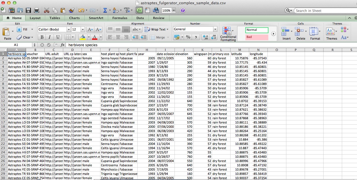
Google continues with its own demonstration using this data. You can either stick with that, or follow mine, which takes a slightly different path, before returning to Google's later steps towards creating a visualisation.
Process or filter data
Go to Google Fusion Tables www.google.com/fusiontables/data?dsrcid=implicit , click to create a fusion table and search for the data set you just downloaded. It will be uploaded and look like this:
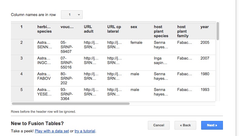
Follow the steps indicated to name the new file and the fusion table is created, with thumbnail images in the two columns of URL links:
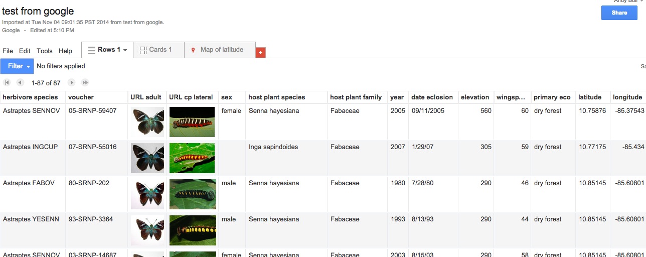
Now we are back to following Google's tuition. Next step is to map (or visualise) the data.
Visualise data
As Google says: "Fusion Tables auto-detects location data in a table and displays a tab called "Map of <location column name>." In this case, the Map tab is titled Map of latitude."
Click Map of latitude. The map appears, with red location dots on it, looking like this:
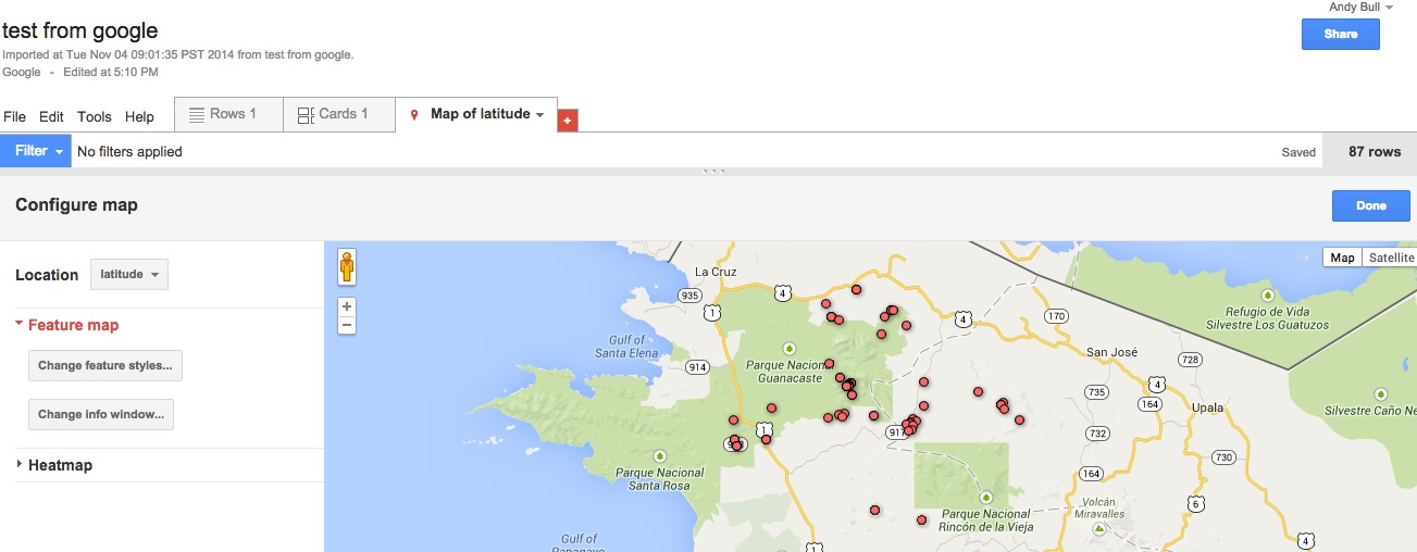
Click on any location dot and an information box appears, like this:
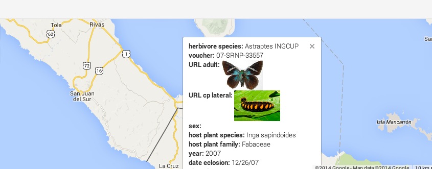
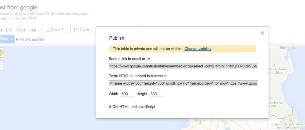
To publish, click on Tools, choose publish from the dropdown, and you can generate embed code or share via a link:
13B9 Using Datawrapper
Sign up for an account at https://datawrapper.de/

There is a tutorial from Datawrapper here: http://blog.datawrapper.de/tutorial/
Click on the New chart tab and you'll be guided through the process of uploading your data.
Find data
Here's a suggestion from them on teacher salaries around the world:
The data is here: www.worldsalaries.org/teacher.shtml
Process or filter data
Copy and paste it into an Excel spreadsheet. The data looks like this:
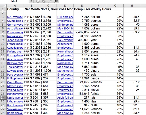
Datawrapper explains that, while there are some interesting aspects to this information, we need to focus on one aspect to create a telling visualisation.
So, they say you should delete all columns other than 'country' and 'net monthly income'. Also delete any empty rows.
Next you upload to Datawrapper. There are two ways to do that, they say. You can copy it in the spreadsheet and then drop it into the field they provide for data uploads. Or, you can upload a .csv file (an abbreviation for comma separated values). If you try to upload a .csv, Datawrapper points out, formatting is important, or it won’t work.
Next, Datawrapper says, you should check and describe your data. You simply check whether the data was imported correctly. There are these options to help Datawrapper get it right:
- "You can decide whether the data should be displayed in rows or columns (which has an effect on visualisations). You can go back to this step at any time and change this setting
- Mark first rows or columns as labels
- Credit and link to the source".
You also need one of your columns to be categorised as 'number'. To do that, click the dropdown by your second column and select 'number'.
Visualise data
Next, click to visualise and you get to select how you want your data presented. You go through three stages: select the chart, refine the chart by adjusting sizes, tell the story by adding a sell to it. You are guided through each of these steps, alerted to any problems and offered solutions.
Finally, click to publish and get your embed code.
As you go through the process, Datawrapper also offers you other datasets to play with.
13B10 Data journalism courses available online
Data Journalism Handbook
http://datajournalismhandbook.org/1.0/en/getting_data.html
Contently: Data Journalism on a Shoestring
Notes
- http://datadrivenjournalism.net
- http://datadrivenjournalism.net
- http://datadrivenjournalism.net
- www.nytimes.com/interactive/business/buy-rent-calculator.html
- http://onlinejournalismblog.com/
- http://datadrivenjournalism.net
- http://datadrivenjournalism.net
- www.theguardian.com/news/datablog/2010/jul/27/wikileaks-afghanistan-data-datajournalism