Posters for The Orphanage
Series of Spanish posters
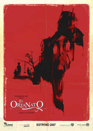
Poster 1

Poster 2
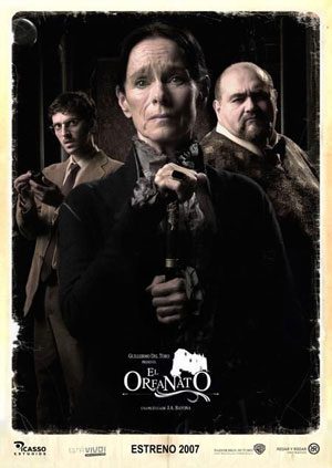
Poster 3
The various posters for El orfanato/The Orphanage offer us the chance to consider the different ways in which distributors try to attract a wide range of audiences to see a film and specifically how they stress specific genre repertoires.
In Spain, El orfanato was a mainstream film – the biggest film of the year at the Spanish box office in 2007. The film seems to have been distributed in Spain by Rodar y Rodar Cine y Television in conjunction with the Hollywood studio major Warner Bros via its Spanish subsidiary. There are two different series of posters – though they use some of the same images. The first three posters share a similar design idea – a portrait-shaped poster featuring a ‘distressed’ image set on a background of yellowing paper. The inference is that these images are offered in the context of a narrative about documents referring to past events. It’s as if the posters themselves have been found in an attic. The images are cracked/creased and torn. But although all three are presented in the same way they use different generic conventions in terms of their subject content.
Poster 1 is painted black on red and features the house – the orphanage – and an outline of the children by the swing. It is a lurid image in which the black watercolour seems to be dripping from the subject over a blood-red background and an image of a skull with a screaming mouth has been superimposed on the house. The whole image invokes a tone that is not there in the film. It suggests shock horror and the most familiar image of this type is from Hitchcock’s Psycho – of the house on the top of the rise as viewed from the Bates Motel. Psycho also includes a mummified corpse with a skull used to shock effect. Presumably this poster was designed to attract a younger (teen) audience with the promise of exploitation horror cinema. Audiences approaching the film on this basis are likely to have been disappointed.
Poster 2 is more ‘legitimate’ in that the content and tone more accurately represent what is in the film. The image places a Medium Close-Up shot of Belén Rueda as Laura in the foreground, taking up the whole left half of the poster. (Rueda is a star in Spain, primarily from television drama.) Behind her is a dark and menacing sky and, in the bottom right of the frame, a (very) long shot of the orphanage. Rueda is wearing the traditional outfit of the orphanage in the 1970s – a long grey shirt-dress with white cuffs and collar. She is looking directly at the camera and her arms are raised in a gesture of alarm and defensiveness – matched by a worried look. Her face is partly in shadow. The genre that this suggest is melodrama. A woman is the protagonist. Her dress suggests that the story is set in the past. The dark sky and Gothic house are expressionist images connoting a disturbed mise en scène. They could refer to horror, but the gesture and expression on Rueda’s face confirm melodrama (i.e. an exaggerated acting style).
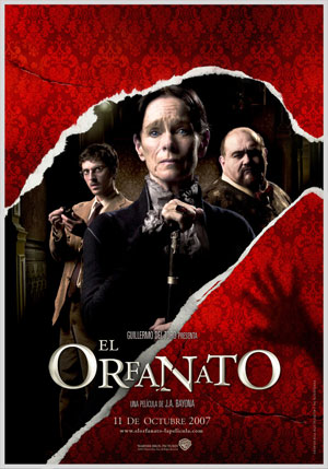
The third poster in this series shows three of the characters involved in the psychic investigation which occurs part way through the plot. In the foreground is Geraldine Chaplin as the medium and behind her are Prof. Bálaban and his assistant. Chaplin is a well-known actor in Spain appearing in many Spanish films following her marriage to director Carlos Saura in the early 1970s, most famously perhaps in Saura’s Raise Ravens (1975) in which she plays a ghost. How many of the Spanish audience would remember that specific film from 30 years earlier? Some perhaps, but like Rueda, Chaplin is a familiar face. The trio of figures also directly represents an unlikely team with the contrast between Chaplin’s costume (and stick) and that of the young man. Chaplin’s position in the foreground puts her in a more important position than the other two. The connotation here is some form of mystery.
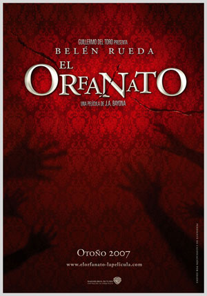
Poster 4
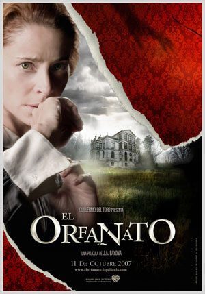
Poster 5
Poster 6
Poster 7
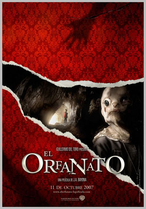
The second set of posters uses some of the same images but places them in a different graphic context. Posters 5 and 6 re-use the images of Rueda and of Chaplin and the two men. Poster 4 uses shadows of children’s hands against a dark red patterned wallpaper. In the other three posters, the wallpaper is torn to reveal the images beneath – a technique used for the animated menus on the DVD. In Poster 7, the image beneath is of the cave by the beach featuring Tomás and Simón. Like the other images, this still does not actually appear in the film, being a composite image. The graphic device of the torn paper is suggestive of an investigation into past events – especially within a household. In this sense it is an accurate representation of the film’s narrative. But do the posters work as well at suggesting genre as the first three?
Poster 4 announces the film as coming in Autumn (Otoño), whereas the other three posters give the opening date. It seems safe to assume that Poster 4 is a ‘teaser’ and that the other three were released together – perhaps running as a trio on billboards or in magazines. The other issue is the use only of the Warner Bros brand (i.e. not Rodar y Rodar). It isn’t clear why this is. Similar images and the same graphics context crops up in Poster 8.
Poster 8
Poster 9
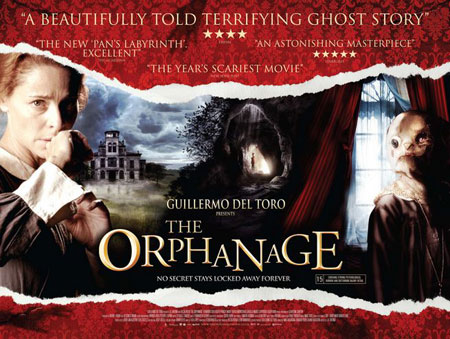
Poster 8 is landscape-shaped – a convention associated with UK outdoor poster sites and cinema point-of-sale displays. It’s worth looking closely at this poster. Notice how the familiar images have been re-drawn or manipulated. Belén Rueda looks more haggard, the sky and house have been re-drawn and the sky colour matches the window, drawing three separate images together. The effect is to change the location. The cave is no longer by the sea (though the coastline is visible by the house. The coherence of the three-in-one image possibly evokes dramas like Wuthering Heights or Jane Eyre – romantic melodramas with Gothic horror undertones. The English language text is much longer here – adding a ‘tag-line’ and several ‘puffs’ from critics. These spell out the genre attractions directly – ‘ghost story’, ‘scariest movie’, ‘secret’ etc. Do you think that this text simply anchors the meaning of the image, enhances it or reduces it? If the meaning is made explicit does it have as much force?
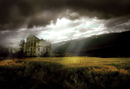
Poster 9 is not a poster as such, but the image was used in the American poster campaign. It’s interesting to see it here as a pure representation of the classic ‘gothic mansion’ – set in wild terrain under a lowering sky.
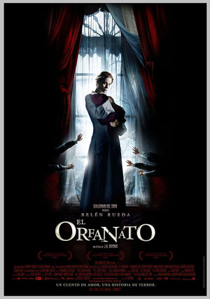
Poster 10
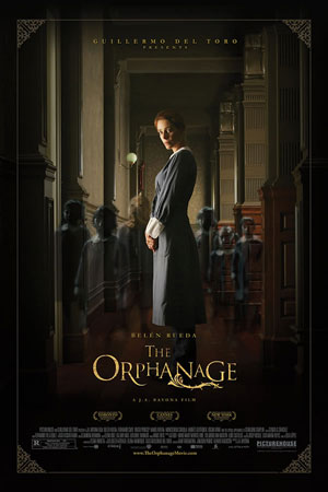
Poster 11
The final two posters are similar in presentation, but different enough in content to suggest different meanings. Poster 10 is again Spanish and comes with a tag-line, discreetly positioned at the bottom of the frame – “a love story, a horror story”. In this portrait poster, Belén Rueda is centre against a French window. Outside are the gnarled shapes of trees and a bright bluish light. Dressed in the orphanage uniform, she carries a bundle in a dark red blanket. We can just see the dark-red wallpaper and curtains, but otherwise the rest of the image is in shadow except for the arms of the children reaching out for Rueda. The overall colour palette is blue-grey-dark red.
Poster 11 again has Rueda centre, but this time she is in a corridor (though it looks ‘open’ to the right). Although the lighting is not bright, we can see clearly. She is standing calmly in repose and the ghostly figures of the children are behind here. Unlike in the Spanish poster, there is no sense of contact between Rueda and the children – they are passive. The colour scheme is more muted and less expressive. The rather delicate cornerpieces (like filigree?) are not indicative of the gothic. This house is old, but well maintained. There is little sense of genre beyond the ghost story and the costume drama – certainly melodrama is not signalled. Surprisingly, Guillermo del Toro’s name does not appear (he is a well-known name in the US) and overall this poster seems to appeal to a rather sedate arthouse audience. Compare it directly with Poster 1 for a real sense of difference. Neither Poster 1 nor Poster 11 properly conveys the sense of the film. Perhaps it isn’t possible to convey the mixture of generic references in a single poster?