Interviews
Anneliese Dodds, Member of Parliament for Oxford East (Labour)
Graham Stuart, Member of Parliament for Beverley and Holderness (Conservative)
Layla Moran, Member of Parliament for Oxford West and Abingdon (Liberal Democrat)
Councilors Denis Healy (East Riding of Yorkshire Council and Beverley Council) and Alison Healy (Beverley Town Council)
Councilor Michele Gibson (Riverside and Laleham – Conservative)
Gallery
Chapter 2
Membership of international organisations as of 2021
This table shows countries' membership of international organisations as of 2021. Courtesy of the Foreign and Commonwealth Office (2006) Diplomacy in a Changing World, http://collections.europarchive.org/tna/20080205132101/fco.gov.uk/Files/kfile/ozintpriorities2006Chap2.pdf, contains public sector information licensed under the Open Government Licence (OGL) v3.0. www.nationalarchives.gov.uk/doc/open-government-licence/open-government
UN Security Council: functions and powers
This table shows the functions and powers of the UN Security Council. Courtesy of the UN Security Council: functions and powers, www.un.org/docs/sc/unsc_functions.html.
Aims of the Council of Europe
This table shows the Aims of the Council of Europe. Courtesy of the Council of Europe (2005).
Winston Churchill
This black and white photo is a portrait of Winston Churchill. Courtesy of David Cole/Alamy Stock Photo.
Clement Attlee
This black and white photo is a portrait of Clement Attlee. Courtesy of United Kingdom National Archives, Public domain.
Edward Heath
This colour photo shows Edward Heath speaking at a microphone. Courtesy of David Fowler/Shutterstock.
Churchill's three circles
This Venn Diagram shows Churchill's three circles - the UK intersecting with the Empire-Commonwealth, the English speaking world and United Europe.
Margaret Thatcher
This black and white photo shows Margaret Thatcher. Courtesy of Keystone Press/Alamy Stock Photo.
Blair's 'bridge' collapses?
This table shows the criticisms aimed at Tony Blair's idea of the UK being bridge between Europe and the US.
Special relationship
This colour photo shows the Obamas and the Camerons at Number 10 Downing Street. 'The special relationship’ is the bedrock of the UK’s thinking on its role in the world. Courtesy of Featureflash Photo Agency/Shutterstock
Chapter 3
Gross value added per head of the population (capita) for the four countries of the UK in 2017
This table shows the Gross value added per head of the population (capita) for the four countries of the UK in 2017. Courtesy of the Office for National Statistics (2017)
Gross value added per capita for the English regions (2017)
This table shows the Gross value added per capita for the English regions (2017). Courtesy of the Office for National Statistics (2017)
Enoch Powell
This black and white photo shows Enoch Powell. Courtesy Trinity Mirror/Mirrorpix/Alamy Stock Photo.
Chapter 4
Bertrand Russell
This black and white photo shows Bertrand Russell. Courtesy of Bettmann/Getty Images.
John Stuart Mill
This black and white photo shows John Stuart Mill. Courtesy of GL Archive/Alamy Stock Photo.
Chapter 5
Conservative party logo
This colour logo shows a Union Jack in the shape of a tree, and is the logo of the Conservative Party. Courtesy of the Conservative Party (www.conservatives.com)
William Hague, created Baron Hague of Richmond in 2015
This colour photo shows William Hague, created Baron Hague of Richmond in 2015. Courtesy of dpa picture alliance archive/Alamy Stock Photo.
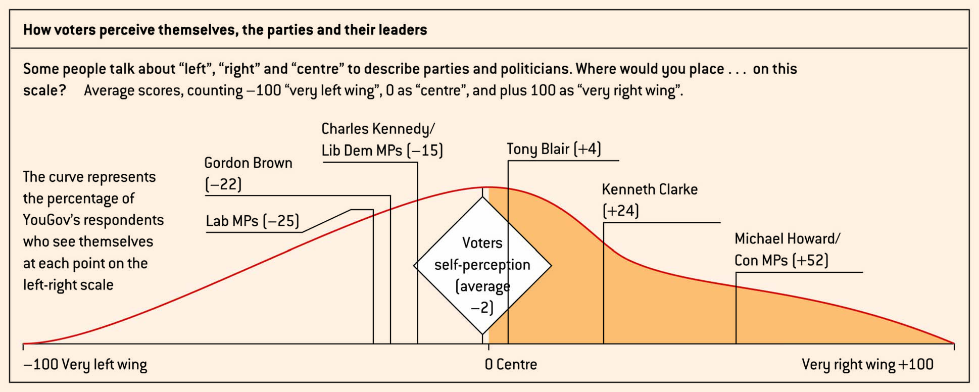
How voters perceive themselves, the parties and their leaders
This table shows how voters perceive themselves, the parties and their leaders, from Very left wing to Very right wing. Courtesy of Policy Exchange (2005) The Case for Change, May 2005. Reproduced with permission.
Labour party logo
This colour logo shows a white rose on a red background, and is the logo of the Labour Party. Courtesy of the Labour Party (www.labour.org.uk).
Liberal Democrats party logo
This colour logo shows a yellow dove, and is the logo of the Liberal Democrat Party. Courtesy of the Liberal Democrat Party (www.libdems.org.uk).
Chapter 6
The four circles of England
This diagram shows how the British Union is at the touching point of three circles - USA, Europe and the Empire.
Joseph Stalin
This black and white photo shows Joseph Stalin. Courtesy of World History Archive/Alamy Stock Photo.
Leon Trotsky
This black and white photo shows Leon Trotsky. Courtesy of GL Archive/Alamy Stock Photo.
Adolf Hitler
This black and white photo shows Adolf Hitler. Courtesy of Sueddeutsche Zeitung Photo/Alamy Stock Photo.
Chapter 7
Chapter 8
Life destinations in UK society based upon Friedman and Laurison’s categories
This table shows life destinations in UK society based upon Friedman and Laurison’s categories
Main parental income-earner’s occupational class
This table shows the main parental income-earner’s occupational class. Adapted from Savage, Mike (2015) Social Class in the 21st Century, Pelican, p. 195.
Chapter 9
Turnout (%) in general elections, 1964–2015 - table
This table shows the turnout (%) in general elections, 1964–2015. The figures for 1964–2010 are from C. Rallings and M. Thrasher: British Electoral Facts 1832–2012 (Biteback Publishing, 2012). Those for 2015 are from the House of Commons Library Briefing Paper (CBP-7186).
UK turnout in general elections, 1964–2015 - graph
This graph shows the turnout (%) in general elections between 1964 and 2015. The figures for 1964–2010 are from C. Rallings and M. Thrasher: British Electoral Facts 1832–2012 (Biteback Publishing, 2012). Those for 2015 are from the House of Commons Library Briefing Paper (CBP-7186).
Party shares of votes in UK general elections, 1964–2015 - table
This table shows the Party shares of votes in UK general elections, 1964–2015. The figures for 1964–2010 are from C. Rallings and M. Thrasher: British Electoral Facts 1832–2012 (Biteback Publishing, 2012). Those for 2015 are from the House of Commons Library Briefing Paper (CBP-7186).
Party shares of votes in UK general elections, 1964–2015 - graph
This graph shows the Party shares of votes in UK general elections, 1964–2015. The figures for 1964–2010 are from C. Rallings and M. Thrasher: British Electoral Facts 1832–2012 (Biteback Publishing, 2012). Those for 2015 are from the House of Commons Library Briefing Paper (CBP-7186).
Turnout in UK elections, 2010–15
This table shows the turnout in UK elections, 2010–15. For general elections: The figures for 1964–2010 are from C. Rallings and M. Thrasher: British Electoral Facts 1832–2012 (Biteback Publishing, 2012). Those for 2015 are from the House of Commons Library Briefing Paper (CBP-7186). For local elections: the series of Local Election Handbooks produced by C. Rallings and M. Thrasher under the auspices of the Local Government Elections Centre, University of Plymouth. For the European Parliament election House of Commons Library Briefing Paper RP14–32. For devolved elections the websites of the relevant legislature.
Turnout of social groups in 2015
This table shows the turnout of social groups in 2015. Courtesy the British Election Study (BES) 2015 face-to-face post-election survey. The original data have been weighted to reflect the actual turnout in the election.
Party shares of votes in 2015 in regions (row %)
This table shows the Party shares of votes in 2015 in regions (row %). Courtesy of House of Commons Library Briefing Paper (CBP-7186).
Social characteristics and party choice in 2015 (row %)
This table shows social characteristics and party choice in 2015 (row %). Courtesy of the British Election Study (BES) 2015 face-to-face post-election survey. The original data have been weighted to reflect the result of the election.
Strength of party identification, 1964–2015
This graph shows the strength of party identification, 1964–2015. Courtesy of the British Election Study (BES).
Vote in 2015 by ratings of party leaders
This table shows the vote in 2015 by ratings of party leaders. Courtesy of the British Election Study (BES) 2015 face-to-face post-election survey. The original data have been weighted to reflect the result of the election.
Chapter 10
Circulation of UK newspapers, January 2020
This table shows the circulation of UK newspapers, January 2020. Adapted from NewsPaper Circulation January 2020: Press Gazette, 20 February 2020 (note Telegraph papers did not contribute data).
A televised debate with party leaders
This colour photo shows a televised debate with party leaders, each standing behind a podium. Courtesy of STEFAN ROUSSEAU/AFP/Getty Images.
Gillian Duffy and Gordon Brown
This colour photo shows Gordon Brown speaking to Gillian Duffy. Courtesy of PA Images/Alamy Stock Photo.
Alastair Campbell
This colour photo shows Alastair Campbell. Courtesy of Paul Smyth/Alamy Stock Photo.
Chapter 11
Female Members of Parliament and candidates, change over time
This graph shows Female Members of Parliament and candidates and the change over time
Percentage of women in parliaments around the world
This table shows the percentage of women in parliaments around the world
Female chairs of select committees, House of Commons
This table shows the female chairs of select committees in the House of Commons. Courtesy of www.parliament.uk/about/parliament-and-women/women-in-parliament-today/select-committee-chairs/, adapted by the author.
Peerage creations by gender, by Prime Minister in power (as of August 2020)
This table show Peerage creations by gender, by Prime Minister in power (as of August 2020). Courtesy House of Lords Library (2015: 35) adapted by the author.
Chapter 12
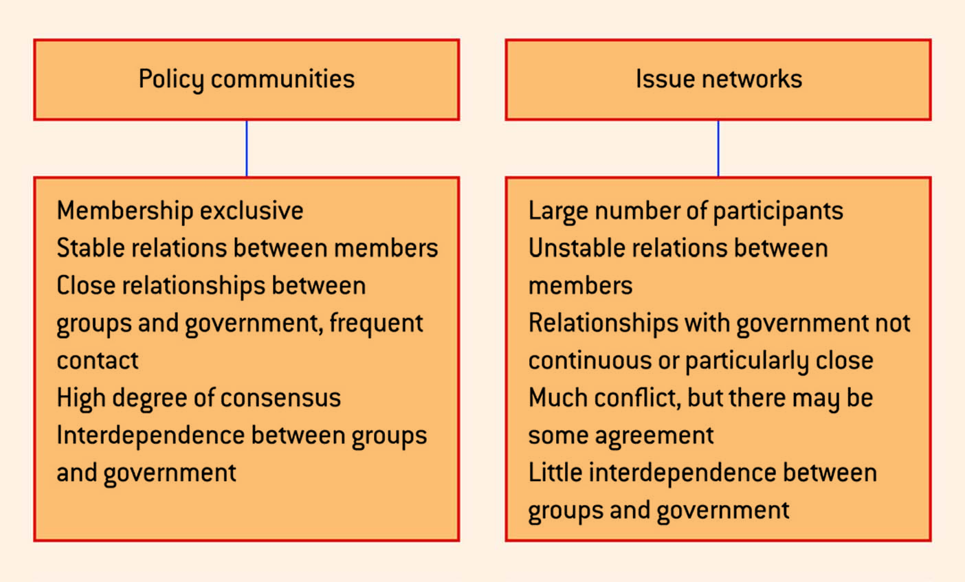
Pressure groups and the policy process
This figure shows pressure groups and the policy process. Courtesy of W. Grant (1988) ‘Pressure groups and the policy process’, Social Studies Review, vol. 3, no. 5, p. 17. Reproduced with permission from the California Council for Social Studies.
Grant’s typology of pressure groups
This figure shows Grant’s typology of pressure groups. Courtesy of W. Grant (1985) ‘Insider and outsider pressure groups’, Social Studies Review, vol. 1, no. 1, p. 17. Reproduced with permission from the California Council for Social Studies.
Pressure groups methods continuum
This figure shows Pressure groups methods continuum. Courtesy of A. McCulloch (1998) ‘Politics and the environment’, Talking Politics, Autumn 1998. Reproduced with permission from The Politics Association
The issue attention cycle
This figure shows the issue attention cycle. Courtesy of A. McCulloch (1998) ‘Politics and the environment’, Talking Politics, Autumn 1998. Reproduced with permission from The Politics Association.
Chapter 13
Recent trends in party membership
This graph shows Recent trends in party membership. Courtesy of Keen, R., and Audickas, L. (2016) Membership of UK Political Parties. House of Commons Library Standard Note 05125, 6 August 2016.
Party membership since the 1950s (1000s)
This table shows Party membership since the 1950s. Data from Keen and Audickas (2016); Audickas et al. (2019)
Party identification (%)
This table shows Party identification (%). Data from Hansard Society (2019) Audit of Political Engagement 16, p. 44
General election results, 2017 and 2019
This table shows General election results, 2017 and 2019. Data from Apostovola et al. (2017); Uberoi et al. (2020)
Effective number of electoral parties and effective number of Parliamentary parties
This table shows the effective number of electoral parties and effective number of Parliamentary parties. Data from Clark (2018); Gallagher (2019)
Chapter 14
Northern Ireland Assembly results, 2007–17 (108 seats; from 2017, 90 seats)
This table shows Northern Ireland Assembly results, 2007–17 (108 seats; from 2017, 90 seats). Courtesy Deacon et al. (2018).
Scottish General Election parliamentary elections results, 2003–16: constituency and regional lists
This table shows Scottish General Election parliamentary elections results, 2003–16: constituency and regional lists. Courtesy Deacon (2012); Tonge (2016).
Senedd Cymru election results, 2003–20: constituency and regional lists
This table shows Senedd Cymru election results, 2003–20: constituency and regional lists
The desire to see primary law-making powers for Wales
This table shows The desire to see primary law-making powers for Wales. Based on data from BBC Wales/ICM polls, June 2007, February 2008, February 2009.
Total identifiable expenditure on services by country and region per head 2018/19
This table shows Total identifiable expenditure on services by country and region per head 2018/19. Courtesy of Public Spending by Region, House of Commons Library, December 2019.
Chapter 15
Referendum results in Scotland and Wales, 1997
This table shows Referendum results in Scotland and Wales, 1997.
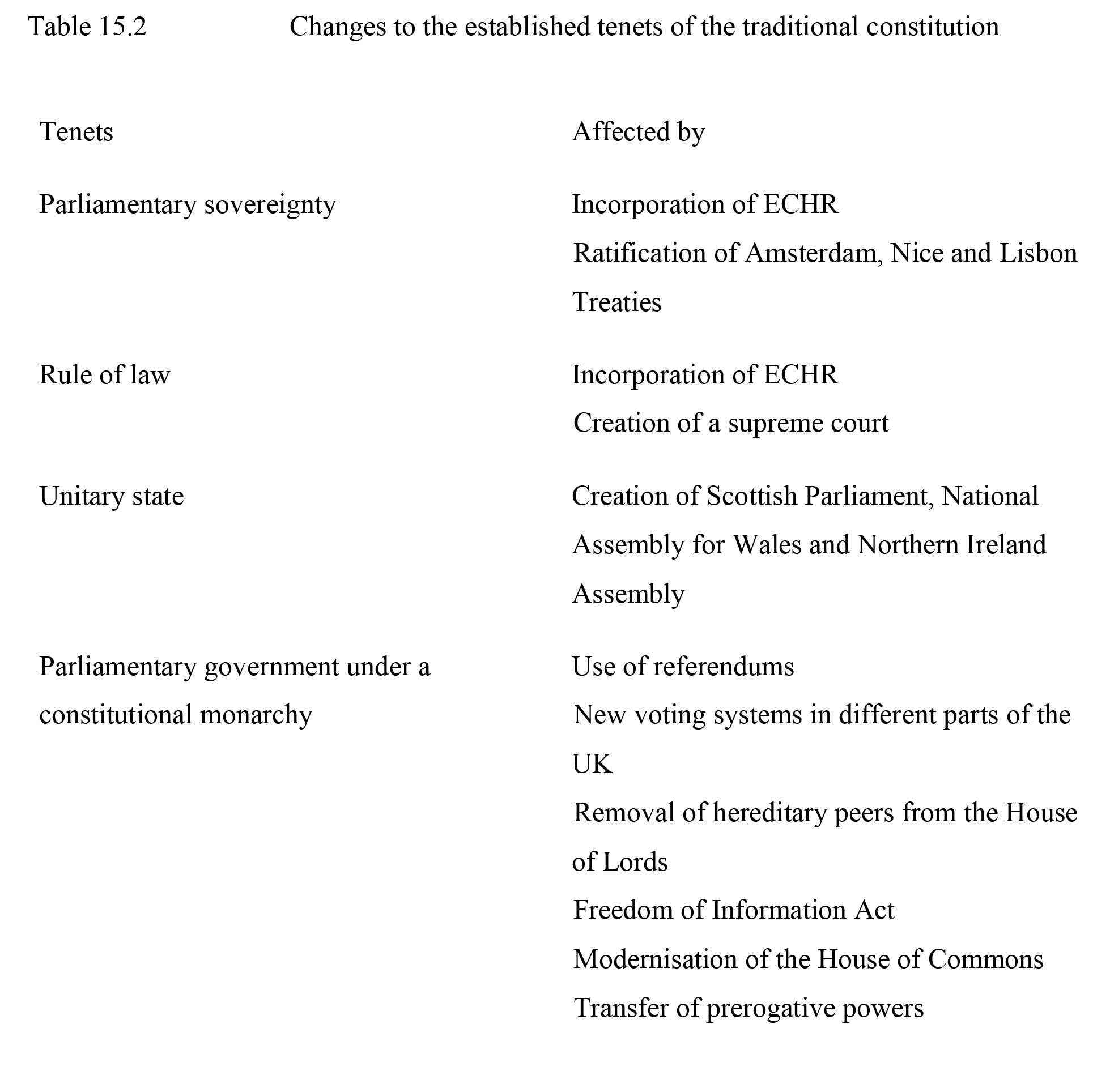
Changes to the established tenets of the traditional constitution
This table shows Changes to the established tenets of the traditional constitution
Result of the referendum on the voting system, 2011
This table shows the Result of the referendum on the voting system, 2011
Chapter 16
Royal ceremonial is symbolic of continuity with the past and of national unity
This colour ohoto shows the Queen and the Duke of Edinburgh at a royal ceremony. Courtesy of Tim Graham Picture Library – Pool/Getty Images.
The Duke and Duchess of Cambridge
This colour photo shows the The Duke and Duchess of Cambridge meeting the public. Courtesy of Danny Martindale/WireImage.
Chapter 17
The House of Commons: length of sittings, 2002–19 (selected sessions)
This table shows The House of Commons: length of sittings, 2002–19 (selected sessions). Data data adapted from the House of Commons Sessional Information Digests, 2001–19.
Grand Committee Room
This colour photo shows the Grand Committee Room. Courtesy of the Parliamentary Recording Unit.
The House of Commons in session
This colour photo shows the The House of Commons in session. Courtesy of PA Images / Alamy Stock Photo.
Departmental and other investigative select committees 2020
This table shows Departmental and other investigative select committees 2020
Meetings of scrutiny select committees, Tuesday 3 November 2020
This figure shows the Meetings of scrutiny select committees, Tuesday 3 November 2020. © Parliamentary copyright, made available for use under the Open Government Licence. www.nationalarchives.gov.uk/doc/open-government-licence/version/3/
Examples of topics of early day motions tabled in the 2019–21 session
This figure shows Examples of topics of early day motions tabled in the 2019–21 session. © Parliamentary copyright, made available for use under the Open Government Licence. www.nationalarchives.gov.uk/doc/open-government-licence/version/3/
Chapter 18
Levels of satisfaction and dissatisfaction (%) with the way Parliament worksQ. How satisfied or dissatisfied are you with the way that Parliament works?
This table shows Levels of satisfaction and dissatisfaction (%) with the way Parliament works, with the question: How satisfied or dissatisfied are you with the way that Parliament works? Data from Hansard Society (2017)
Perceptions of MPsQ. In general, whose interests do you think MPs put first: their own, their constituents’, their party’s, or the country’s?
This table shows Perceptions of MPs with the question: In general, whose interests do you think MPs put first: their own, their constituents’, their party’s, or the country’s? Adapted from data from Ipsos MORI
Chapter 19
Composition of the House of Lords, 18 November 2020
This table shows Composition of the House of Lords, 18 November 2020. Data from www.parliament.uk, under Parliamentary copyright under the Open Government Licence.
Chamber of the House of Lords
This colour photo shows the Chamber of the House of Lords. Courtesy of Kirsty Wigglesworth – WPA Pool/Getty Images.
House of Lords sittings and daily attendance
This table shows the House of Lords sittings and daily attendance. Data from www.parliament.uk, under Parliamentary copyright under the Open Government Licence.
Amendments agreed to Government Bills in the House of Lords, 2016–7
This table shows Amendments agreed to Government Bills in the House of Lords, 2016–7
House of Lords Order Paper, 30 November 2020
This figure shows the House of Lords Order Paper, 30 November 2020. Courtesy of www.parliament.uk; © Parliamentary copyright, made available for use under the Open Government Licence v3.0.
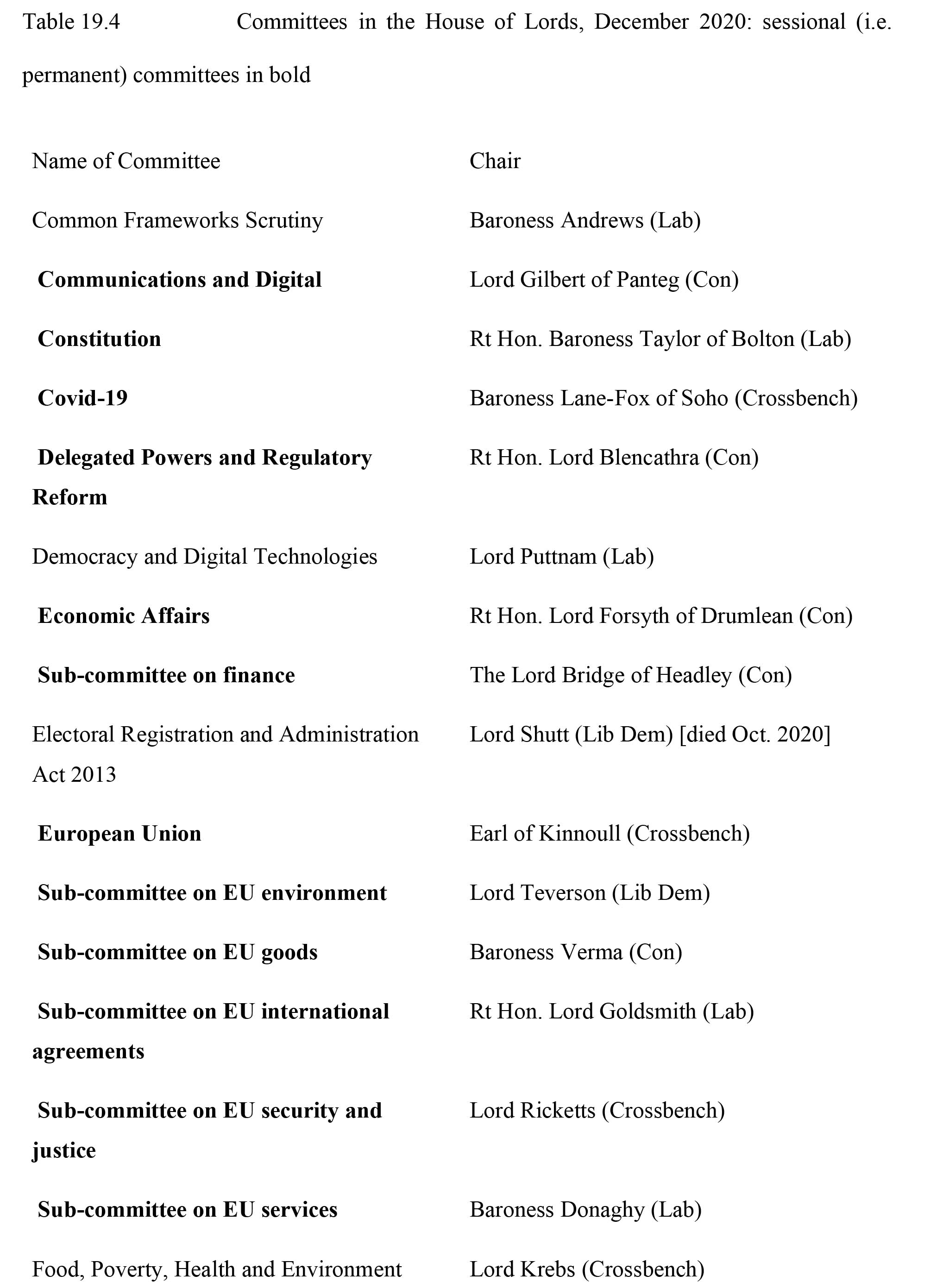
Committees in the House of Lords, December 2020: sessional (i.e. permanent) committees in bold
This table shows Committees in the House of Lords, December 2020: sessional (i.e. permanent) committees in bold.
Chapter 20
No. 10 Downing Street
This colour photo shows a police officer outside the black front door of No. 10 Downing Street. Courtesy of dominika zarzycka/Shutterstock.
A unique occasion when the Queen sat in on a Cabinet meeting
This colour photo shows the Queen sitting in on a cabinet meeting, with Prime Minster David Cameron and ministers. Courtesy of PA Images/Alamy Stock Photo.
Chapter 21
Chapter 22
Scale of European local government – UK in a league of its own
This table shows the scale of European local government – UK in a league of its own. Data from OECD (2019) Key Data on Local and Regional Governments in the European Union
The structure of local government in the UK (2021)
This figure shows the structure of local government in the UK (2021). Adapted from Wilson and Game (2011) Local Government in the United Kingdom (5th edn) (Basingstoke: Palgrave Macmillan), p. 86.
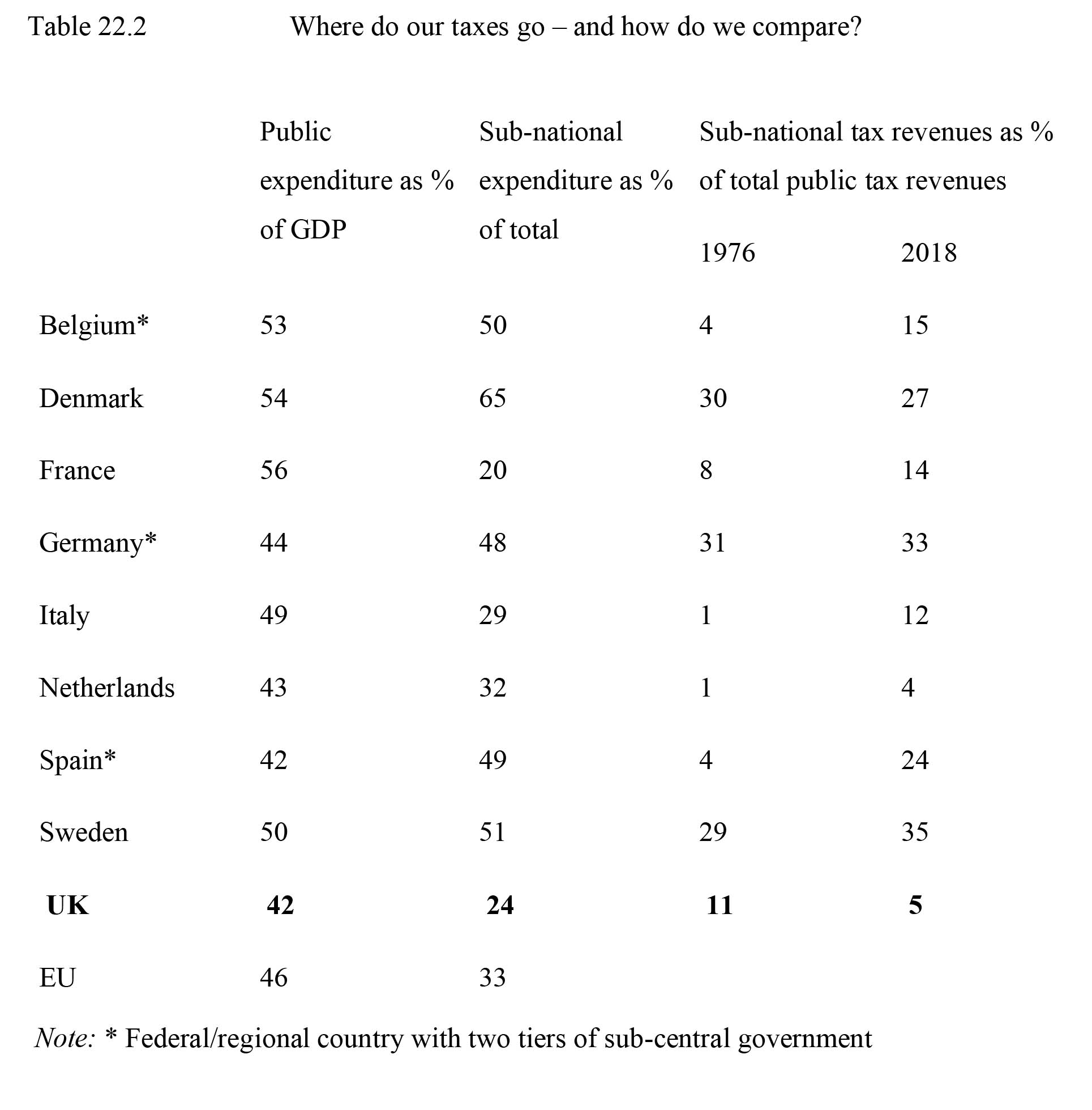
Where do our taxes go – and how do we compare?
This table shows where our taxes go – and how do we compare? Data from OECD (2020) Revenue Statistics 1965–2019.
Local government in England: three generations of Unitary Authorities
This figure shows Local government in England: three generations of Unitary Authorities Left: 2009; Key red: Metropolitan boroughs; orange: London boroughs; green: unitary authorities; pink: two-tier non-metropolitan counties. Right: 2020/21; unitary authorities. Figure 22.2a from English_administrative_divisions_2010.svg: Nilfanion; derivative work: Dr Greg, Wikimedia Commons. Licensed under the Creative Commons Attribution-ShareAlike 3.0 Unported licence: https://creativecommons.org/licenses/by-sa/3.0/legalcode
Figure 22.2b from Gwdihwˆ, Wikimedia Commons. Licensed under the Creative Commons CC0 1.0 Universal (CC0 1.0), Public Domain Dedication.
Council compositions and control: England, Scotland, Wales – January 2021
This table shows Council compositions and control: England, Scotland, Wales – January 2021. Courtesy of Open Council Data.
Local government services in England and who provides them
This table shows Local government services in England and who provides them. Adapted from Game (2016: 19).
Trends in UK public sector employment (millions)
This table shows Trends in UK public sector employment (millions). Courtesy of ONS, Data set: Public Sector Employment (Sept. 2020), Tables 1 and 2.
New spending in 2009–10 and 2019–20 (2019–20 £ per person), by decile of deprivation
This figure shows New spending in 2009–10 and 2019–20 (2019–20 £ per person), by decile of deprivation. Courtesy of T. Harris, L. Hodge and D. Phillips, IFS Briefing (2019b), p. 3
England’s 25 directly elected mayors (2021)
This table shows England’s 25 directly elected mayors (2021)
Major structural changes: Combined Authorities and devolution deals
This table shows Major structural changes: Combined Authorities and devolution deals.
Chapter 23
Baroness Hale of Richmond
This colour photo shows Baroness Hale of Richmond. Courtesy of PA Images/Alamy Stock Photo.
The Middlesex Guildhall, Supreme Court entrance
This colour photo shows The Middlesex Guildhall, Supreme Court entrance. Courtesy of David Levenson/Alamy Stock Photo.
Judicial salaries, from 1 April 2020
This table shows Judicial salaries, from 1 April 2020. Adapted from Ministry of Justice, Judicial Salaries from 1 April 2020 (London: Ministry of Justice, 2020).
Women and ethnic minority judges in the UK, 1995–2020
This table shows Women and ethnic minority judges in the UK, 1995–2020. Data from JUSTICE (2017: 15); Ministry of Justice (2020).
Chapter 24
The policy-making process
This figure shows the policy-making process. From ‘The policy making process’ by Burch, M. (1979) in British Politics Today (Jones, B., and Kavanagh, D., 1979), Manchester University Press
David Hume
This black and white photo of a painting shows David Hume. Courtesy of GeorgiosArt/iStock.
Michael Oakeshott
This black and white photo shows Michael Oakeshott. Courtesy of History collection 2016/Alamy Stock Photo.
Anthony Giddens
This colour photo shows Anthony Giddens. Courtesy of Jeff Morgan 11/Alamy Stock Photo.
Chapter 25
Michael Howard
This colour photo shows Michael Howard at an event. Courtesy of David M. Benett/Getty Images for Bell Pottinger.
More people are imprisoned in more unequal countries
This figure shows that more people are imprisoned in more unequal countries. Adapted from Wilkinson and Pickett (2010)
Attrition within the criminal justice system (percentage of offences committed)
This figure shows attrition within the criminal justice system (percentage of offences committed). Courtesy of Digest 4: Information on the Criminal Justice System in England and Wales (Barclay, G., and Tavares, C., 1999), Home Office Research, Development and Statistical Directorate, contains public sector information licensed under the Open Government Licence v3.0.
Crimes recorded by the police, 1857–1997
This figure shows crimes recorded by the police, 1857–1997. Courtesy of Digest 4: Information on the Criminal Justice System in England and Wales (Barclay, G., and Tavares, C., 1999), Home Office Research, Development and Statistical Directorate, contains public sector information licensed under the Open Government Licence v3.0.
Conviction rates: British Crime Survey of England and Wales
This figure shows conviction rates: British Crime Survey of England and Wales. Courtesy of the Office of National Statistics (ONS), contains public sector information licensed under the Open Government Licence v3.0
Overview of the main crime types: England and Wales, year ending September 2019
This table shows an overview of the main crime types: England and Wales, year ending September 2019. Courtesy of Office of National Statistics (ONS) National Crime Statistics, 2019
Chapter 26
Social policy spending and total government spending, in millions of pounds, at current prices
This table shows Social policy spending and total government spending, in millions of pounds, at current prices. Data from OECD (2020a), Government Expenditure by Function (COFOG)
Employment within public administration, education and health, headcount in thousands
This graph shows employment within public administration, education and health, headcount in thousands. Author’s own based on data from Office for National Statistics (2019)
William Henry Beveridge
This black and white photo shows William Henry Beveridge. Courtesy of Popperfoto via Getty Images/Getty Images.
Social expenditure since 1990, as a percentage of GDP
This graph shows Social expenditure since 1990, as a percentage of GDP. Based on data from OECD (2020b)
Social expenditure in 1980
This graph shows Social expenditure in 1980. Based on data from OECD (2020b). NB: Figures for mandatory private spending on unemployment are not included as they were not available for 1980.
Social expenditure in 2018
This graph shows Social expenditure in 2018. Based on data from OECD (2020b). NB: Figures for mandatory private spending on unemployment are not included as they were not available for 1980
Chapter 27
Chapter 28
NSRA priority risks 2015
This table shows NSRA priority risks 2015. Data from National Security Strategy and Strategic Defence and Security Review 2015: A Secure and Prosperous United Kingdom, Cm 9161, November 2015. Annex A – Summary of the National Security Risk Assessment 2015, p. 87
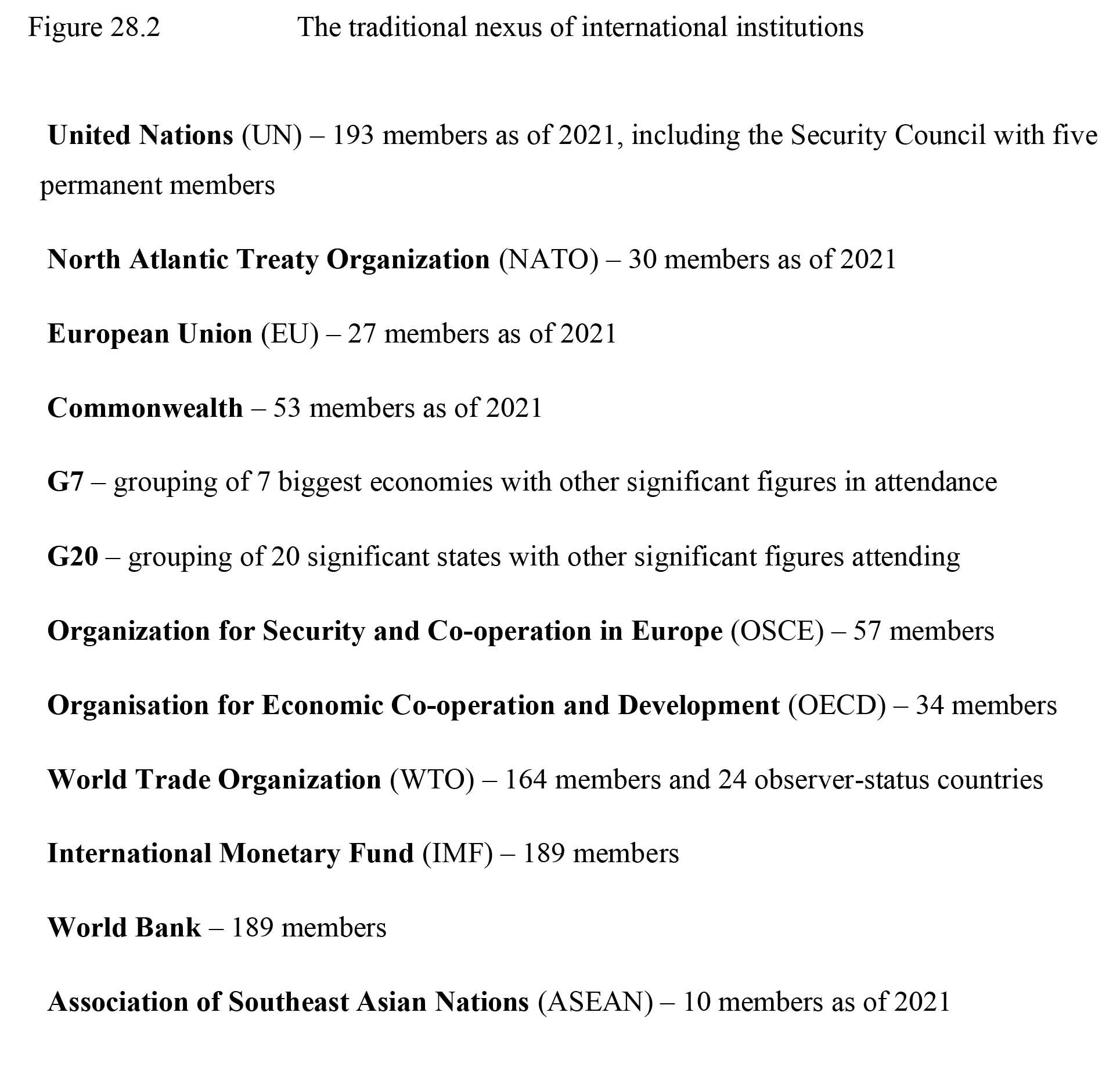
The traditional nexus of international institutions
This figure shows the traditional nexus of international institutions
Beyond Brexit: a Global Britain
This figure shows extracts from Boris Johnson’s first major policy speech on becoming Foreign Secretary. 2 December 2016. from speech Beyond Brexit: a Global Britain, www.gov.uk/government/speeches/beyond-brexit-a-global-britain, © Crown copyright 2011, licensed under the Open Government Licence v.3.0
Simplified thematic version of security, defence and foreign policy-making.* Foreign, Commonwealth and Development Office** National Cyber Security Centre*** Her Majesty’s Revenue and Customs. COBRA is the ad hoc, top level emergency committee procedure.
This figure shows a simplified thematic version of security, defence and foreign policy-making
Chapter 29
Map of the EU
This figure shows a map of the EU. Courtesy https://commons.wikimedia.org/wiki/File:Map-of-european-union-member-countries.png. Mahnox, Wikimedia Commons. Licensed under the Creative Commons Attribution-Share Alike 4.0 International licence: https://creativecommons.org/licenses/by-sa/4.0/deed.en
Map of the EU including overseas countries and territories
This figure shows a map of the EU including overseas countries and territories. Courtesy https://commons.wikimedia.org/wiki/File:EU_OCT_and_OMR_map_en.png. Alexrk2, source from Natural Earth data, Wikimedia Commons. Licensed under the Creative Commons Attribution-Share Alike 3.0 Unported licence: https://creativecommons.org/licenses/by-sa/3.0/deed.en.
National and European identity in the UK
This graph shows National and European identity in the UK. Courtesy of European Commission (2020), Eurobarometer Interactive.
National and European identity, EU average
This graph shows National and European identity, EU average. Courtesy of European Commission (2020), Eurobarometer Interactive.
European Parliament election results 2009–19
This table shows European Parliament election results 2009–19. Courtesy of https://europarl.europa.eu/election-results-2019/en/national-results/united-kingdom/2009-2014/constitutive-session/
Income inequality in the EU
This graph shows Income inequality in the EU. Courtesy of OECD (2019), Income inequality (indicator). doi: 10.1787/459aa7f1-en (Accessed on 25 January 2021)
Objective characteristics of Leave voters
This figure shows objective characteristics of Leave voters. Courtesy of Swales, K. (2016) Understanding the Leave vote. NatCen Social Research. London. Available at: http://natcen.ac.uk/our-research/research/understanding-the-leave-vote/
Referendum vote and social values
This figure shows the Referendum vote and social values. Courtesy of Ashcroft, Lord (2016). How the United Kingdom voted on Thursday… and why. Lord Ashcroft Polls. Available at: https://lordashcroftpolls.com/2016/06/how-the-united-kingdom-voted-and-why/
Useful Websites
Chapter 1
Chapter 2
- BBC (2009) ‘Browns’s Speech to Congress’
- Bevin, E. (1949) ‘Opening Address at Council of Europe’
- Blair, T. (1999) ‘Doctrine of the International Community’, Economic Club, Chicago
- Blair, T. (2004) ‘Speech at the Lord Mayor’s Banquet’, London, 15 November
- Brown, G. (2009) ‘Speech to the US Congress’. In The Times, 4 March
- Cameron, D. (2010). ‘Joint Press Conference with President Barack Obama’. 20 July
- Charter of the Commonwealth (2013)
- Conservative Party (2010) General Election manifesto, ‘Invitation to Join the Government of Britain’
- Cook, R. (1997)
- Evening Standard (2011) ‘Well done lads: President and PM barbecue burgers for heroic troops’
- Garton Ash, T. (2003) ‘Anti-Europeanism in America’. The New York Review, February 13
- Hague , W. (2009) Speech at the International Institute for Strategic Studies, London, ‘The Future of British Foreign Policy’, 21 July
- Hague, W. (2014) ‘The Future of British Foreign Policy’, London, 15 April
- HM Government (2010) ‘Securing Britain in an Age of Uncertainty: The Strategic Defence and Security Review’
- NATO (2016) ‘The North Atlantic Treaty’, 4 April
- New York Times (1991) ‘The Empire strikes back’
- Sevastopulo, D. , and Parker G. (2017) ‘Trump hands May promise of “stronger” special relationship’, Financial Times, 27 January
- Click to view external links
Chapter 3
- The government’s National Statistics Online
- This fact-checking website is also useful for verifying government data
- Population data can also be found here
- Annual editions of Social Trends are published online and the British Social Attitudes Survey is available
- Recent ‘British Social Attitudes’ survey information (2015)
- This government website also provides useful and up-to-date population data As do these websites:
http://www.ageuk.org.uk/Documents/EN-GB/Factsheets/Later_Life_UK_factsheet.pdf?dtrk=true
http://www.ons.gov.uk/peoplepopulationandcommunity/healthandsocialcare/healthandlifeexpectancies/bulletins/healthstatelifeexpectanciesuk/2016to2018#life-expectancy-in-the-uk
http://www.ons.gov.uk/peoplepopulationandcommunity/populationandmigration/populationestimates/articles/overviewoftheukpopulation/august2019
See also recent census information
- For recent data on immigration see The Migration Observatory
- This government website also provides useful and up-to-date income data
- For recent information on the UK service sector see
- For economic data and reports see the Institute of Fiscal Studies (IFS) website www.ifs.org.uk and comparative data is available from the Organisation for Economic Co-operation and Development (OECD) at http://www.oecd.org and also the World Economic Forum at https://www3.weforum.org/
- Also see House of Commons Library website for various welfare spending figures and data on women MPs
- Social class analysis can be found at The Great British Class Survey – Results, BBC website, 3 April 2013
- Recent information on church attendance and religious beliefs in the UK (2015–18):
- Click to view external links
Chapter 4
- The World’s Smallest Political Quiz
- Internet Encyclopedia of Philosophy
- Click to view external links
Chapter 5
- Centre for Policy Studies
- Conservative Party
- Institute of Economic Affairs
- Institute of Public Policy Research
- Labour Party
- Liberal Democrats
- Click to view external links
Chapter 6
Chapter 9
- http://www.electoralcommission.gov.uk/ and https://markpack.org.uk/155623/voting-intention-opinion-polls-scorecard/
- Click to view external links
Chapter 11
Chapter 12
- Directory of 120 NGO websites
- Amnesty International
- Countryside Alliance
- Friends of the Earth
- Greenpeace
- Outrage!
- Trades Union Congress
- Blog
- Click to view external links
Chapter 13
- Conservative Home
- Labour List
- Liberal Democrat Voice
- Bright Green
- Scottish National Party
- Click to view external links
Chapter 14
- The BBC and national newspapers in Wales, Scotland and Northern Ireland offer a range and depth of the coverage of devolved politics that is not found in the UK press.
Democracy Live BBC Politics coverage, detailed and up-to-date devolution coverage
Devolution Matters: a blog by Dr Alan Trench that gives regular summaries and comment of the latest events in devolution across the UK
University College London’s Constitution Unit’s devolution programme
- Click to view external links
- England
The Ministry of Housing, Communities & Local Government is the government department responsible for English devolution/decentralisation
The Greater London Authority and London Mayor’s official website
- Click to view external links
- Northern Ireland
Northern Ireland Assembly
Northern Ireland Executive (government)
- Click to view external links
Chapter 15
- Organisations with an interest in constitutional change
- Constitution Unit
- Electoral Reform Society
- Campaign for Freedom of Information
- Click to view external links
- Reports
- Independent Commission on the Voting System (the Jenkins Commission)
- Ministry of Justice, The Governance of Britain, Cm 7170
- Ministry of Justice, Review of Voting Systems: The Experience of New Voting Systems in the United Kingdom since 1997, Cm 7304
- Royal Commission on the Reform of the House of Lords (the Wakeham Commission), A House for the Future
- Click to view external links
- Government departments with responsibility for constitutional issues
- Cabinet Office
- Home Office
- Ministry of Justice
- Click to view external links
- Parliamentary bodies
- House of Lords Constitution Committee
- House of Commons Public Administration and Constitutional Affairs Committee
- Click to view external links
- Other official bodies
- The Electoral Commission
- Click to view external links
- European bodies
- European Convention on Human Rights
- Click to view external links
Chapter 16
- Official royal websites
- Royal family
- Online magazine
- Prince of Wales
- Crown Estate
- Click to view external links
- Nominations for public honours
- Nomination process
- Click to view external links
- Organisations favouring reform
- Republic
- Centre for Citizenship
- Click to view external links
- Organisation supporting the monarchy
- Constitutional Monarchy Association
- Click to view external links
- Survey data on attitudes towards the royal family
- Ipsos MORI
- ComRes
- YouGov
- ICM
- Gallup
- Click to view external links
Chapter 17
- Parliamentary websites
- Parliament
- Bills before Parliament
- Parliamentary committees
- Guide to parliamentary select committees
- Parliamentary education service
- Hansard
- Click to view external links
- Other related websites
- Hansard Society for Parliamentary Government
- Click to view external links
Chapter 18
- Parliamentary websites
- Parliament
- Click to view external links
Chapter 19
- Parliamentary websites
- Government Whips’ Office
- House of Lords
- House of Lords Select Committees
- The Work of the House of Lords
- Click to view external links
- Reform
- HM Government, The House of Lords: Reform:
- HM Government (2011) House of Lords Reform Draft Bill
- Joint Committee on the Draft House of Lords Reform Bill, Draft House of Lords Reform Bill
- Ministry of Justice, An Elected Second Chamber: Further reform of the House of Lords
- Report of the Royal Commission on the Reform of the House of Lords (Wakeham Commission)
- Unlock Democracy (pro-election)
- Click to view external links
- Opinion surveys
- ICM
- Populus
- YouGov
- Ipsos MORI
- Click to view external links
Chapter 20
Chapter 21
- Ministers
- List of government ministers
- Ministerial responsibilities
- Ministerial Code
- Click to view external links
- Civil service
- Civil Service
- Civil Service Code
- First Division Association of Civil Servants
- Cabinet Office
- Civil Service Learning
- Click to view external links
- Related websites
- Public Administration and Constitutional Affairs Committee of the House of Commons
- Click to view external links
Chapter 22
- Age UK (2019) Social care reform and funding (England) –
- Aitkenhead, D. (2020) ‘Could I have beaten Theresa May in 2017? Yeah, possibly’, Sunday Times News Review, 27 December 27,
- Albert, A. (2019) ‘Prime Minister Boris Johnson says he has a plan to “fix the crisis in social care once and for all”’, Carehome.co.uk,
- Buck, D. (2020) The English local government public health reforms: An independent assessment,
- Conservative Party (2019) Get Brexit Done: Unleash Britain’s Potential – The Conservative and Unionist Party Manifesto 2019,
- Cook, G. (2020) ‘Suddenly, inexplicably, we all fancy Andy Burnham’, Vogue, 22 October,
- Department for Business, Energy and Industrial Strategy (BEIS) (2020) Local Enterprise Partnerships: Capacity and Capabilities Assessment,
- Economist (2010) ‘The unlikely revolutionary’, 14 August,
- Fawcett Society (2019) Press release: New Fawcett data reveals that women’s representation in local government ‘at a standstill’.
- Game, C. (2019) ‘Bye-bye Babergh, hello South Suffolk’, Local Government Chronicle, 3 October,
- Game, C. (2020a) ‘England’s systemic centralisation: instinctive and fatally costly’, Political Studies Association Blog,
- Game, C. (2020b) ‘Social care reform: comprehensive is good, but comprehensible vital’, INLOGOV Blog, 7 August,
- Game, C. (2020c) ‘Andy Burnham was right: this Prime Minister can’t handle devolution’, INLOGOV blog, 26 November,
- Game, C. (2020d) ‘Simon Clarke – first his speech goes, then him’, INLOGOV Blog, 25 September,
- Gilroy, R. (2020) ‘Social care reform could be five years away, admits PM’, Nursing Times, 14 January,
- Harris, T., Hodge, L., and Phillips, D. (2019a) English local government funding: trends and challenges in 2019 and beyond. Institute for Fiscal Studies.
- Harris, T., Hodge, L., and Phillips, D. (2019b) IFS Briefing: English local government funding: trends and challenges in 2019 and beyond Institute for Fiscal Studies.
- Heseltine (Lord) (2012) No Stone Unturned: in pursuit of growth,
- HM Government (2010) The Coalition: our programme for government,
- Hortas-Rico, M. , and Rios, V. (2018) Is there an optimal size for local governments? GEN Working Paper A 2018–9, Universida de Vigo,
- House of Commons (2012) Political and Constitutional Reform Committee – Prospects for codifying the relationship between central and local government: Draft Code,
- House of Commons (2020) Social care: funding and workforce – Third Report of Health and Social Care Committee, Session 2019–21 (HC 206),
- IPPR North (2019) Divided and Connected: State of the North 2019,
- King’s Fund (2019) A short history of social care funding reform in England: 1997 to 2019,
- King’s Fund (2020) Adult social care funding and eligibility: our position,
- LGA (Local Government Association) (2012) Independence from the Centre: Does local government’s freedom lie in a formal acknowledgement of devolution?
- LGA (2018) A Councillor’s Workbook on Local Government Finance,
- LGA (2019a) Queen’s Speech – On the Day Briefing, 14 October 2019,
- LGA (2019b) Guidance for new councillors 2019/20,
- Merrick, N. (2019) ‘The rise of the “super” parish council’, LocalGov, 26 June,
- NAO (National Audit Office) (2020a) The government’s approach to test and trace in England – interim report,
- NAO (2020b) The government’s approach to test and trace in England – interim report,
- Neild-Ali, K. (2020) Councillors’ allowances – TaxPayers’ Alliance, p. 2.
- Nuffield Trust (2019) How to fund social care? 15 options for funding social care,
- Nuffield Trust (2020) Blog post: How much social care does each country fund?,
- OECD (Organisation for Economic Co-operation and Development) (2019) Key Data on Local and Regional Governments in the European Union (Paris: OECD Publishing),
- OECD (2020) Revenue Statistics 1965–2019 (Paris: OECD Publishing) –
- Open Democracy (2020) Serco and Sitel to get more public money despite track-and-trace fiasco,
- Place North West (nd) IPPR: UK power more centralised than any other country,
- Pogrund, G. , and Calver, T. (2020) ‘Chumocracy first in line as ministers splash Covid cash’, Sunday Times, 15 November,
- Prime Minister’s Office (2019) The Queen’s Speech 2019,
- Rajan, S. , Comas-Herrera, A. , and Mckee, M. (2020) ‘Did the UK government really throw a protective ring around care homes in the COVID-19 pandemic?’, Journal of Long-Term Care, pp.185–95,
- Rand Europe (2020) Funding options for the NHS and Social Care in the UK,
- Sobolewska, M., and Begum, N. (2020) ‘New census reveals extent of lack of ethnic minority representatives in local councils’, The Conversation 8 July 8.
- Tussell (2020) Latest updates on UK Government COVID-19 contracts and spending,
- Click to view external links
Chapter 23
- Judicial process in the UK
- Courts and Tribunals Service
- Criminal Cases Review Commission
- Judicial Committee of the Privy Council
- Judiciary of England and Wales
- Magistrates’ Association
- Ministry of Justice
- Supreme Court
- Click to view external links
- Other relevant sites
- Court of Justice of the European Union (CJEU)
- European Court of Human Rights
- Click to view external links
Chapter 24
- Fabian Society
- Demos
- Catalyst
- 10 Downing Street
- Anti-ID Card Group
- Click to view external links
Chapter 25
- Home Office
- Prison Service
- Police Service
- Click to view external links
Chapter 26
- The King’s Fund offers a wealth of expert and high-quality commentary, particularly on health care reforms
- The Child Poverty Action Group provides well-informed commentary on benefits, an area where good-quality information is often lacking
- The Joseph Rowntree Association reports on a variety of social policy topics
- The OECD provides a wealth of statistics and commentary on all of the social policy areas touched on in this chapter
- Paul Spicker’s social policy website contains a wealth of resources for students interested in expanding their knowledge of theory and concepts in social policy
- Click to view external links
Chapter 27
- The website of HM Treasury is an essential reference point for current developments in economic policy (http://www.hm-treasury.gov.uk) as is that of the Bank of England (http://www.bankofengland.co.uk). The Institute of Fiscal Studies provides high-quality independent assessment of the economy and economic policy (http://www.ifs.org.uk), as does the National Institute of Economic and Social Research (http://www.niesr.ac.uk), many of whose warnings have been vindicated by events. The OECD (http://www.oecd.org) is a reliable source of data and commentary on the UK in relation to other advanced economies.
- Click to view external links
Chapter 28
- Foreign and Commonwealth Office (soon to be Foreign, Commonwealth and Development Office)
- Ministry of Defence
- Royal United Services Institute
- Policy Exchange
- Institute of Public Policy Research
- Chatham House (Royal Institute of International Affairs)
- International Institute for Strategic Studies
- British Foreign Policy Group
- European Union, Official Site
- Defence Academy of the United Kingdom
- Demos
- Institute for Government
- Click to view external links
Chapter 29
Chapter 30
- Immigration rules http://www.gov.uk/guidance/immigration-rules. A collection of the UK government’s current Immigration Rules.
- Joint Council for the Welfare of Immigrants (JCWI) page on their campaign against the Hostile Environment http://www.jcwi.org.uk/Pages/Category/ending-the-hostile-environment. Information and resources from one of the main organisations campaigning against the UK government’s hostile environment, presenting policies, campaigns and legal action from their perspective.
- Migration Observatory https://migrationobservatory.ox.ac.uk/. Evidence-based analysis and briefings on migration and migrants in the UK, from researchers based at the University of Oxford.
- Our Migration Story https://www.ourmigrationstory.org.uk/. Historical information on migration to Britain and how Britain has been shaped by migration since AD 43 up to the twenty-first century, designed as a teaching resource but useful for anyone, produced by the Runnymede Trust and overseen by Professor Claire Alexander, University of Manchester.
- Windrush Lessons Learned Review https://assets.publishing.service.gov.uk/government/uploads/system/uploads/attachment_data/file/876336/6.5577_HO_Windrush_Lessons_Learned_Review_LoResFinal.pdf. Report of an independent review, commissioned by the Home Secretary, into the events leading up to the Windrush Scandal, and identifying key lessons for the Home Office.
- Click to view external links


